Preview image. Unlock full-res
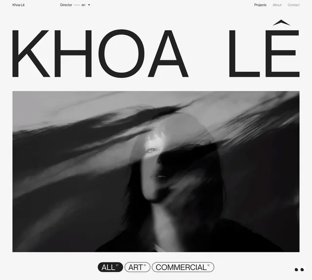
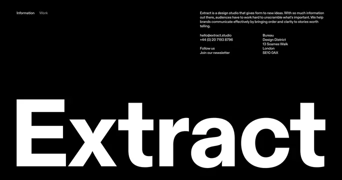
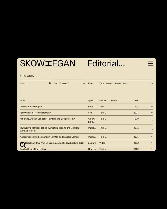
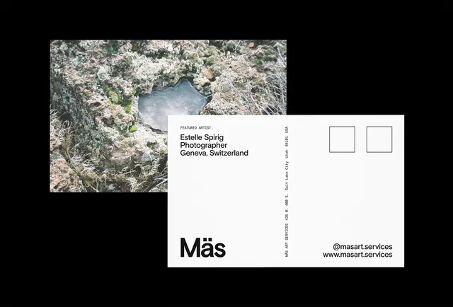
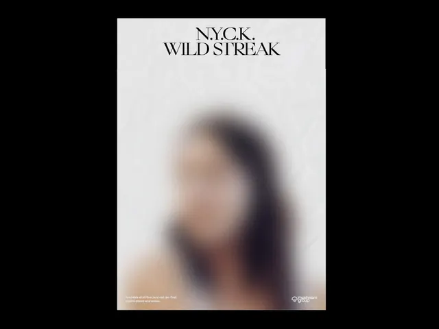
A clean, minimalist layout showcasing a designer portfolio or professional website with stark contrast between light background and dark text areas.
Summary
A minimalist designer portfolio interface that uses a two-tone monochromatic palette with clean sans-serif typography and generous whitespace to present work in an elegant, professional manner.
Visual description
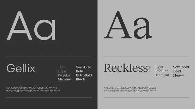
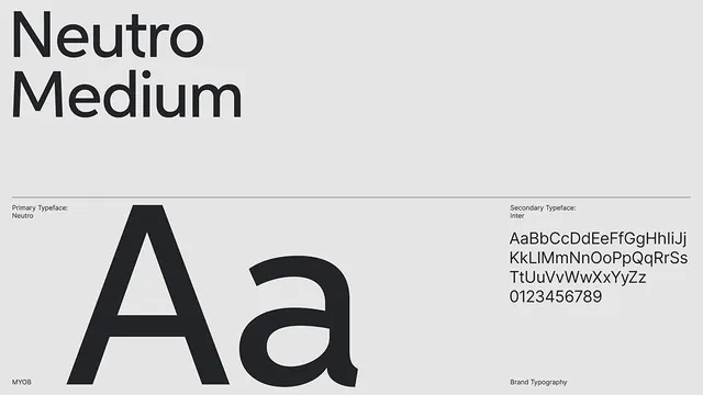
Landscape-oriented composition with a very clean, sparse layout dominated by light tan-beige background contrasting with dark near-black text and design elements. Typography appears to be a modern geometric sans-serif, used at various scales to create hierarchy. The layout demonstrates restraint with significant whitespace throughout, suggesting a high-end or premium approach. Dark rectangular elements or blocks appear to be image placeholders or content areas, creating visual structure. The overall impression is of a professional portfolio or designer website where the layout itself demonstrates design competence through its cleanliness and clarity. Grid structure is evident but subtle.
Key takeaway
The power of radical minimalism in professional presentation. By limiting the palette to pure contrast and using only typography and simple shapes, the portfolio demonstrates design confidence and professionalism. The approach keeps focus on content rather than decoration.
Reuse notes
Excellent reference for designer portfolios, professional services websites, or any context where restraint communicates expertise. The minimalist approach works particularly well for architecture, design, photography, or other visual disciplines where the portfolio work should take center stage. The monochromatic palette with high contrast is ideal for elegant, premium positioning. Works well for B2B contexts where simplicity conveys professionalism and attention to detail.