Preview image. Unlock full-res
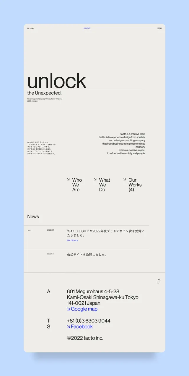
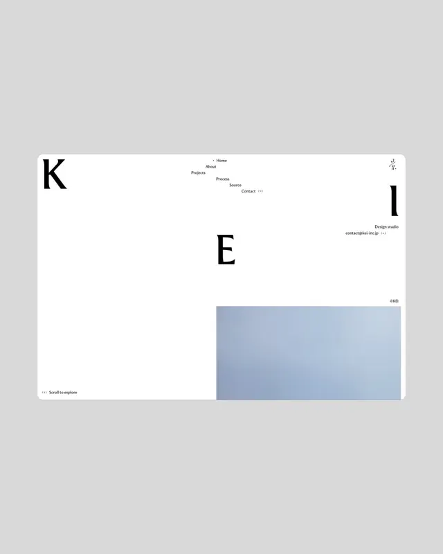
Stripped-down web interface showing large "K" and "E" letterforms alongside minimal navigation links and a muted blue accent block at bottom.

Summary
A minimalist portfolio website interface using oversized letterforms as primary navigation, with sparse menu links and a structural muted-blue rectangle anchoring the lower half.
Visual description
A light grey background hosts a clean layout dominated by two large black sans-serif letterforms: "K" (upper left) and "E" (center). Above the "K" sits a horizontal micro-navigation bar (About, Portfolio, Process, Team, Contact, etc.) in small, uppercase type. To the far right, a secondary "Design studio" label with contact information in minimal grey text. The lower half is bisected by a generous muted-blue rectangle (pale periwinkle or dusty blue) that extends off the right edge, creating an asymmetric, architectural frame. Every element is deliberately spaced; whitespace defines the composition.
Key takeaway
Large letterforms used as content placeholders and structural anchors rather than literal type—a sophisticated approach to web navigation that prioritizes visual hierarchy and breathing room. The asymmetric two-tone block provides structural depth without clutter. This layout exemplifies contemporary minimalist web design for creative practices.
Reuse notes
Excellent reference for design studios, architects, and creative agencies seeking understated navigation systems. The oversized letter treatment works best when the site's actual content is spare and image-focused. The muted-blue accent demonstrates how a single, restrained color can anchor an otherwise achromatic layout. Pairs well with full-bleed imagery and generous margins.