Preview image. Unlock full-res
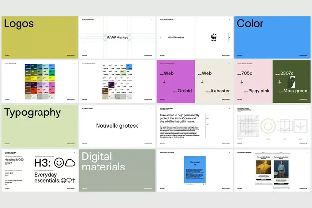
A design system specification poster displaying logo lockups, color palettes with hex codes, typography specimen, and material guidelines for a natural-toned corporate brand.
Summary
A design system specification poster displaying logo lockups, color palettes with hex codes, typography specimen, and material guidelines for a natural-toned corporate brand.
Visual description
A systematic grid layout showing six major design-system sections: top-left large yellow-olive box labeled "Logos" with a horizontal logo treatment displayed (WWF Market wordmark); center-top and right sections show logo variations and usage examples on white backgrounds. A large structured color palette grid occupies the left-center, displaying approximately fifty color swatches organized by hue with black labels and hex codes. Right side shows full-color swatches (orchid, alabaster, piggy pink, moss green) each with hex value and descriptive name. Below the color section, a light sage box labeled "Typography" showcases "Nouvelle grotesk" as the primary sans-serif, with body copy beneath discussing Arctic Ocean conservation. Bottom tier includes emoji/symbol reference (heading + body essentials), "Digital materials" section with associated imagery, and layout or asset guidelines. The overall composition uses a strict grid, generous white space, and a restrained palette of off-whites, muted olives, teals, and pinks to convey systematic rigor and natural sophistication.
Key takeaway
The modular card-based system for breaking down complex brand information into digestible chunks (color swatches on their own, type specimen on its own, logos separate from usage patterns). The combination of visual samples with hex codes and descriptive labels makes this both machine-readable and human-accessible. The restrained palette and typography specimen together tell a coherent brand story without appearing over-designed. The grid structure demonstrates how to organize dense reference material without visual chaos.
Reuse notes
Essential reference for designing or documenting a corporate brand system, especially for nonprofits, B2B, or environmental/natural-product companies where warmth and trustworthiness matter. The earthy color palette and clean typography work across digital and print applications. The card-based layout translates well to responsive design systems and component libraries. Reserve this level of detail and modularity for brands with significant internal or external audience. The hex codes and material section (Digital materials) suggest this was produced for internal guidelines, not public spec.