Preview image. Unlock full-res
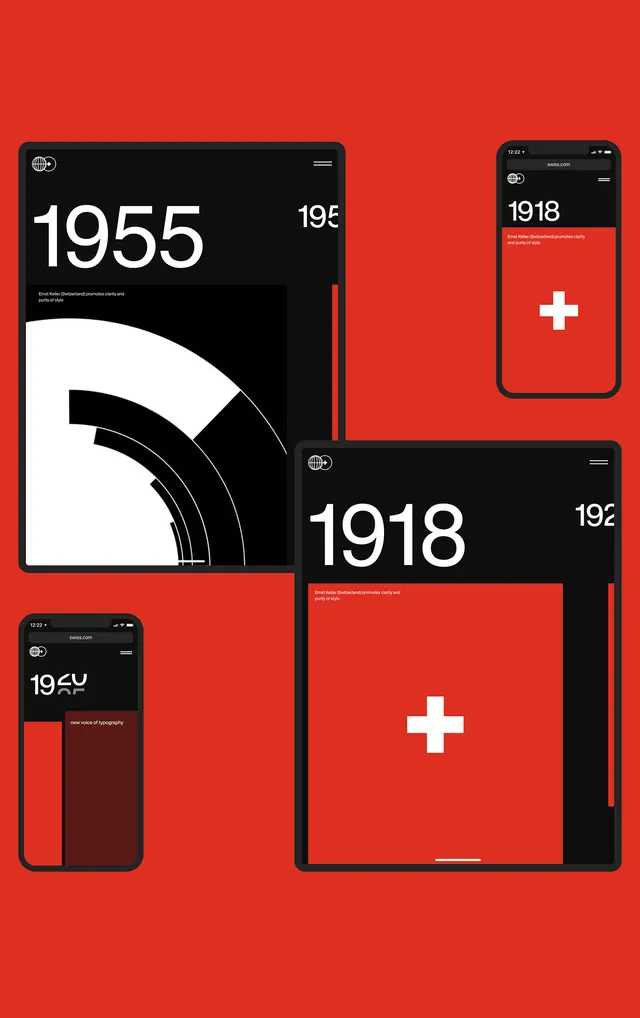
A portfolio of grid-based composition studies and Swiss design principles shown across multiple devices and layout variations.
Summary
An educational course layout showcasing Swiss grid-based design principles and composition techniques across desktop, tablet, and mobile mockups with a bold red and black color scheme.
Visual description
Three separate device mockups arranged in a scattered grid: a large tablet/iPad view on the left showing numeric content (1955, 195), a medium smartphone view top-right, and a smaller smartphone view bottom-left. All devices have dark (near black) screens with white text and bright red accent elements forming geometric shapes or callouts. The background is a vibrant red (#DB2C23). Each device shows different composition variations. All typography is clean, sans-serif, uppercase, and minimal. The devices themselves are rendered with thin black borders and realistic depth. Overall composition demonstrates responsive design thinking and grid-based alignment principles.
Key takeaway
How to present grid and composition principles through actual application across multiple breakpoints. The bold red-black-white palette creates visual hierarchy and draws attention without distraction. The scattered device arrangement shows progression or variation systematically.
Reuse notes
Excellent for education, course marketing, or design system documentation. The device mockup approach is effective for showing responsive design concepts. Works well for B2B or SaaS platforms targeting designers. Red accent color is bold and energetic—ensure it aligns with your brand. The swiss grid approach is timeless and professional; works equally well in minimal or maximalist contexts.