Preview image. Unlock full-res
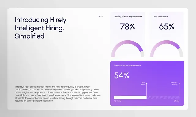
A light-mode HR hiring platform landing page that leads with three oversized percentage metrics supported by donut-chart visualizations and a dark purple embedded dashboard card.
Summary
A light-mode HR SaaS metrics page that anchors three bold stat callouts (78%, 65%, 54%) to donut-chart visualizations, then drops a dark purple dashboard preview card as an embedded proof element.
Visual description
The page opens with a large serif-weight headline ("Introducing Hirely: Intelligent Hiring, Simplified") on the far left against a near-white background. The right half of the upper section holds two labeled donut charts -- "Quality of Hire Improvement" at 78% and "Cost Reduction" at 65% -- rendered in light purple arcs on pale gray tracks, with the percentage numerals large and centered. Below those, a dark purple card occupies the lower-right quadrant, displaying a third metric ("Time-to-Hire Improvement") at 54% in white on an aubergine background, with a small comparison bar chart underneath showing traditional versus new-hire timelines. The lower-left quadrant carries four-line body copy in muted gray at small scale. Spacing is generous throughout and the only chromatic accent is the purple family.
Key takeaway
The two-zone split where prose and headline own the left and data visualizations own the right keeps reading and scanning separate without a hard divider. Using one accent color family (light lavender arcs, mid-purple numerals, dark aubergine card) across all three metric units creates instant coherence without extra design work. The contrast flip -- light background with a dark-background embedded card -- gives the most important metric a natural focal weight.
Reuse notes
Strong template for any B2B SaaS or HR-tech "results" or "by the numbers" section. The donut + numeral combo reads well at small sizes and in screenshot contexts. Requires genuinely compelling numbers to justify the visual weight. The dark card insert technique works best when one stat outranks the others and you want hierarchy without adding a new section.