Preview image. Unlock full-res
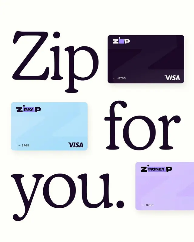
Three card variants for a payment UI system with oversized sans-serif typography anchoring layouts at different orientations.
Summary
A payment system UI showcasing three card variants (dark navy, light blue, and lavender) with the Zip brand, each displaying masked card numbers and Visa branding, interspersed with oversized headline text reading "Zip for you."
Visual description
Three card mockups arranged diagonally with large sans-serif display type interlocking the composition: "Zip" (oversized, navy), "for" (right-aligned, navy), "you" (bottom-left, navy). The dark navy card (top-right) has white Zip logo and card number, rounded corners, subtle depth. The light blue card (left) repeats the Zip Pay branding with same card-number masking pattern. The lavender card (bottom-right) shows Zip Money branding with identical visual treatment. All cards use rounded-rectangle shapes with consistent typography hierarchy and neutral-to-cool color blocking. Pure white background maximizes contrast.
Key takeaway
The typographic interlocking of oversized display type with product mockups creates a grid-defying hierarchy without a container grid. Each card variant is shown in context, establishing visual consistency while allowing layout flexibility. The color palette (cool purples, blues, navy on white) differentiates product tiers without confusion.
Reuse notes
Strong for fintech or payments product marketing where you need to showcase multiple tiers or variants. Works best when the text and product cards balance each other spatially. Works on light backgrounds; may need contrast adjustment if adapted to dark.