Preview image. Unlock full-res
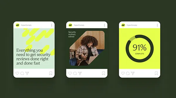
Three mobile card mockups showcasing a security compliance app with bold lime-yellow geometry, dark photography, and oversized metric display against a dark-green background.
Summary
Three mobile mockup cards for a compliance app layered over dark forest-green, each with a different treatment: a bold geometric headline card, a portrait photography card, and an oversized metric card all using high-contrast lime-yellow and white.
Visual description
Three rounded-corner mobile mockups arranged horizontally on a dark earthy-green background. Each card is a white screen with the yellow HyperClearly badge logo at the top and a bottom interaction bar with heart, message, and share icons. The left card features a bright lime-yellow geometric pattern (diagonal lines or chevrons) covering the upper half, with a black headline in clean sans-serif reading "Everything you need to get security reviews done right and done fast" below. The center card displays a portrait photograph of a person against a wood-grain or tan background with text at the top edge (hard to read at size). The right card shows a large black circle containing a white "91%" metric, set against a bright lime-yellow background filling the card. All three cards maintain consistent branding and interaction patterns while showcasing different content types: messaging, imagery, and data presentation.
Key takeaway
The bold use of a single neon accent color (lime-yellow) against dark and white to create immediate visual hierarchy and trust. The variety of card types within a mobile-first frame demonstrates how one design system can handle text-heavy, image-heavy, and metric-heavy content. The geometric pattern as a subtle background texture that does not compete with the headline.
Reuse notes
Strong reference for security, compliance, or SaaS product mobile experiences where trust and clarity are paramount. The high-contrast approach works well for apps where users need to scan and act quickly. The lime-yellow neon reads as optimistic and action-oriented while the dark-green background grounds the interface. Best deployed when you have multiple card types to showcase within a single product frame.