Preview image. Unlock full-res
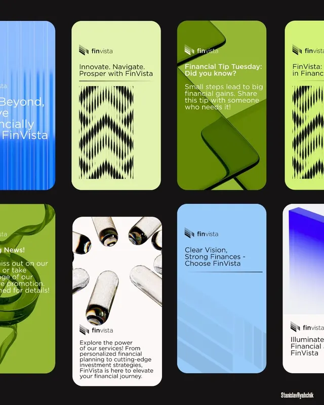
Fintech app screen grid showcasing FinVista product screens using lime-green, teal-blue, and dark navy backgrounds with bold typography and geometric pattern accents.
Summary
Fintech app screen grid showcasing FinVista product screens using lime-green, teal-blue, and dark navy backgrounds with bold typography and geometric pattern accents.
Visual description
Six mobile app mockups arranged in a 3x2 grid on a black background. Top-left screen features vertical blue lines suggesting data visualization. Surrounding screens use lime-green (accounts/messaging), teal-blue (financial guidance), and white (detailed content) backgrounds. Each screen displays the FinVista logo, copy about financial services, and illustrations: one with vertical line patterns, another with wavy geometric dividers in dark navy and lime-green, and a still-life product photograph (headphones/tech items) on the white screen. Headlines use bold display weight sans-serif emphasizing product benefits ("Innovate. Navigate. Prosper with FinVista", "Clear Vision, Strong Finances"). Color scheme consistently pairs lime-green accents with teal-blue as secondary, creating visual cohesion.
Key takeaway
The lime-green and teal-blue pairing (complementary cool-tone vibrance) stands apart in fintech. Geometric wave dividers and line patterns break up solid color blocks with rhythm. Using mixed content types (text, pattern, photography) across screens shows application versatility without overwhelming the grid.
Reuse notes
Ideal for fintech and finance app presentations. The grid layout is effective for showcasing multiple features in marketing contexts. The color system works well for investment, wealth-management, or banking verticals. Wave dividers translate well to web presentations and pitch decks.