Preview image. Unlock full-res
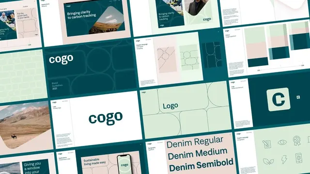
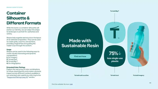
Brand identity page showing how container shapes adapt from 1:1 icons to landscape and portrait layouts, anchored by sustainable-resin product messaging and a 75% plastic-reduction stat.
Summary
Brand identity documentation showing how a core 1:1 container shape scales to hold logos, text, big typography, product imagery, and infographics, anchored by a sustainability-focused product example and a quantified environmental benefit.
Visual description
Light mint background split left-to-right, left side containing descriptive text layout explaining the container shape system, right side showing implementation with large rounded-rectangle shapes in teal and light cyan. Center large dark-teal rounded square holds white headline type (main selling point) plus a button. Flanking shapes in lighter cyan display product icon (with "To hold Big T" label), product bottle in hand with humidity effects, and stat callout (75% reduction) in white type. Small text labels below each shape explain its function (hold CTA, hold text, hold imagery). Clean sans-serif throughout in professional weights.
Key takeaway
The scaled-shape system that fluidly adapts from icon to layout container. The pairing of substantial teal shapes with smaller cyan accent containers guides hierarchy without typography alone. Positioning stat callout inside a shape rather than free-floating gives it structural weight and draws attention naturally.
Reuse notes
Works for product-forward brands needing flexible visual language. The light background-to-shape contrast makes it legible for guideline documentation. Good fit for consumer or sustainability brands wanting to lead with a quantified benefit. Teal-mint palette feels fresh without trendy; could swap colors while keeping the system.