Preview image. Unlock full-res
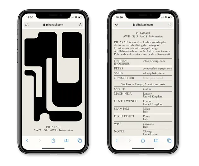
Luxury fashion brand web interface split between bold geometric abstraction and dense information architecture, displayed on mobile viewports.
Summary
Luxury fashion brand web interface split between bold geometric abstraction and dense information architecture, displayed on mobile viewports.
Visual description
Two iPhone frames side by side on a light background. Left phone: a mobile browser (Safari) displays the Pihakapi website with "pihakapi.com" in the address bar. The screen is dominated by a large abstract geometric form—bold black and white rounded rectangles stacked and overlapping in a playful yet sophisticated composition, filling most of the viewport. Small text at the bottom reads "PIHAKAPI" and "AW19 SS19 AW18 Information". Right phone: the same header and navigation, but the main viewport shows dense organizational information in a left-aligned, line-separated table format. Entries include "PIHAKAPI" (brand description mentioning Italian manufacturer Pellemoda and creative director Vejas Kruszewski), section headers in all caps (GENERAL INQUIRIES, PRESS, SALES, NEWSLETTER, SSENSE, MACHINE.A, GENTLEWENCH, SLAM JAM, DEGLI EFFETTI, WISE, NOTRE), paired with corresponding email addresses or locations. All text is a refined serif font (appears to be a high-contrast serif or similar editorial typeface) in black on cream background. The contrast between the visual-first left screen and text-dense right screen creates narrative movement: form then information.
Key takeaway
The split-screen visual metaphor (abstract mark then tabular details) tells a complete brand story without redundancy. The geometric form on the left occupies space confidently while remaining fully abstract, avoiding distraction. Pure black-and-white palette with cream background maximizes legibility and luxury perception. Typography uses weight and spacing to create hierarchy even in a dense directory format. The layout pairs well with directional navigation (arrows visible in original interface), suggesting progression or expansion.
Reuse notes
Strong pattern for luxury brands, design consultancies, or premium-tier services that need to present brand identity alongside operational details. The geometric left side can be swapped for photography, illustration, or a product shot; the right always remains functional reference material. Works best on mobile when the split is vertical or when frames are side-by-side (tablet/desktop). The monochrome aesthetic reads as sophisticated and editorial, suiting fashion, architecture, furniture, and curator-led platforms. Dense information pages benefit from this visual-first framing to maintain perceived elegance despite high content density.