Preview image. Unlock full-res
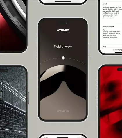
Product showcase pairing smartphone and desktop mockups of Atomic, a dark-mode app with field-of-view visualization, using minimal typography and striking red accents on warm beige background.
Summary
Product showcase of the Atomic app with deep navy smartphone frame displaying a field-of-view visualization, paired with supporting product photography against a warm beige backdrop and striking red accent panel.
Visual description
The layout is a three-part horizontal composition: left side shows a close-up architectural photograph in grayscale with strong grid lines; center features a large smartphone mockup with rounded-corner frame displaying Atomic's dark interface (deep charcoal background, white "Atomic" wordmark, centered circular field-of-view graphic with a white dot and curved line, small-cap sub-copy below); right panel is vibrant red with blurred product photography. Neutral beige background grounds the entire composition. Typography is minimal and geometric, with generous whitespace within the phone frame.
Key takeaway
The stark red accent panel creates aggressive visual contrast and draws the eye without competing with the central product display. Pairing the geometric field-of-view visualization (clean, technical, single focal point) with photography creates a credible yet artistic product story. The horizontal three-part structure balances product detail, abstraction, and brand energy.
Reuse notes
Strong for SaaS, technical, or developer-focused product launches. The deep color palette and geometric visualization work best for apps emphasizing precision or spatial thinking. High contrast requires supporting photography that reads well in desaturation.