Preview image. Unlock full-res
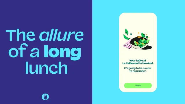
Split-screen mobile UI for restaurant booking confirmation with deep indigo text side and bright cyan card interface side.
Summary
Split-screen mobile UI for a restaurant booking confirmation with large headline typography on an indigo side and a contained reservation card on a bright cyan background.
Visual description
Left half displays oversized italic sans-serif text in bright cyan ("The allure of a long lunch") over a deep indigo background, with a small cyan fork icon placed low. Right half shows a rounded cream-colored card floating on a bright cyan gradient, containing a hand-drawn salad illustration in muted greens and pinks, booking confirmation text ("Your table at Le Taillevent is booked. It's going to be a meal to remember."), and a bright lime-green rounded button labeled "Share". The color palette is deliberately vibrant and approachable: rich indigo, bright teal, soft cream, and accent lime-green. Typography is clean sans-serif, set in a mix of scales and weights.
Key takeaway
The confident color blocking of two opposing emotional registers (typographic drama on indigo; friendly interface on cyan) split cleanly down the middle; the playful scale contrast between the large headline and the compact card; the soft illustration that adds personality without overwhelming the confirmation message.
Reuse notes
Well-suited to food-service, reservation, or hospitality mobile experiences where personality and reassurance need to coexist. The split-screen approach can feel staged; most effective when each side has a distinct functional role. The illustration style would need to match brand character; this one uses muted, friendly line work that reads as approachable rather than trendy.