Preview image. Unlock full-res
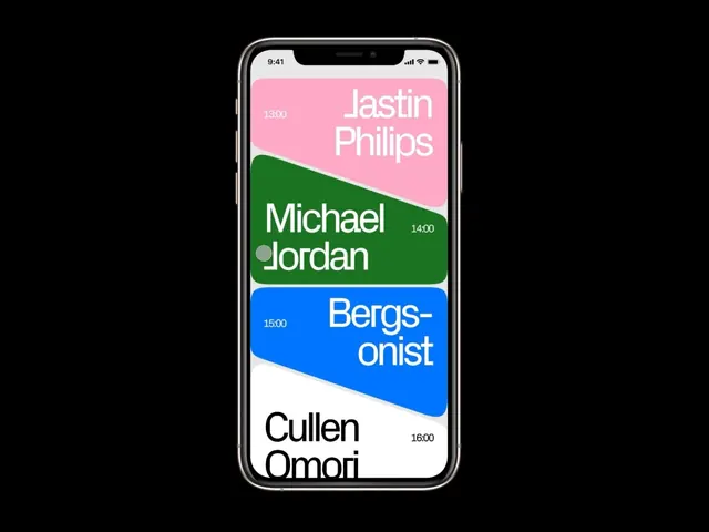
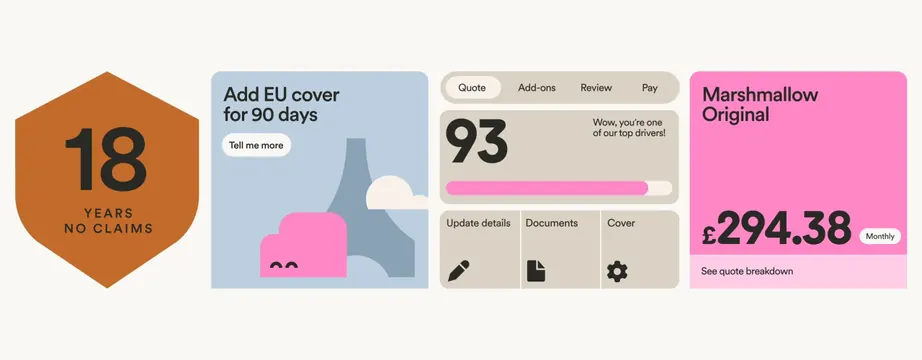
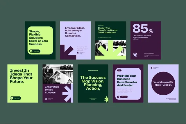
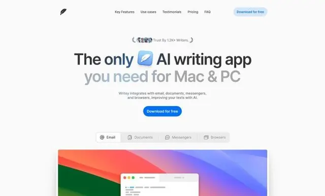
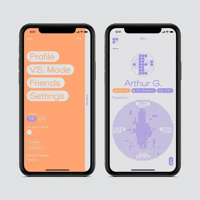
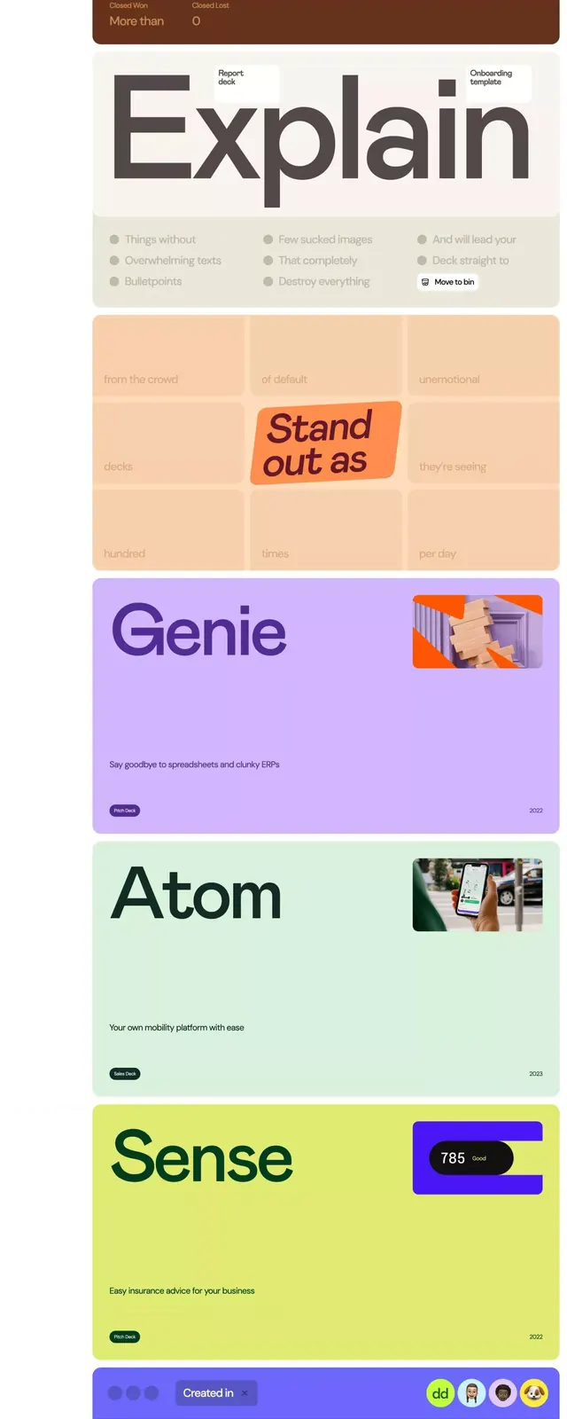
Vertically stacked service-category cards in a rainbow palette (yellow, green, orange, brown, pink, purple, blue, red), each with an icon block and bold label.
Summary
Stacked vertical UI cards in a bright rainbow sequence, each labeled with a service name and paired with a small square icon or emoji accent, using flat color blocking for visual clarity.
Visual description
Nine service-category cards stacked vertically, each spanning the full width. From top to bottom: yellow (We create presentations that usually), green (Raise), orange (Sell), beige (Explain), light pink (Great service), light purple (Genie), light green (Atom), light blue (Sense), purple (Modern collaborative tech), and orange (The sales part ends here). Each card has a solid background color, left-aligned white text label in bold sans-serif, and a small square or emoji-style icon in the top-right or bottom-right corner, typically in a complementary or contrasting hue. The stack creates a dense, vibrant visual menu suitable for a platform offering multiple features or services.
Key takeaway
Rainbow color blocking on stacked cards creates instant visual organization and makes scanning feature lists engaging rather than bureaucratic. Pairing each card with a small icon gives viewers a memorable visual shorthand without cluttering the layout. The consistent width and height of cards creates predictable, scannable rhythm.
Reuse notes
Excellent for SaaS dashboards showing available features, service tiers, or platform capabilities. Works best with 5-9 items; fewer feels empty, more than ten gets hard to scan quickly. The strong colors work on white or light neutral backgrounds; avoid placing on complex imagery or dark backgrounds where contrast suffers.