Preview image. Unlock full-res
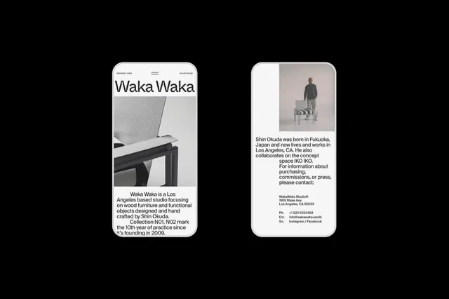
Two-card portfolio presentation for Waka Waka, a Los Angeles furniture studio, using monochrome grids and large-format serif typography on off-white paper mockups.
Summary
Two portfolio cards for Waka Waka, a Los Angeles furniture studio, each with monochrome grids, large serif type, and a photograph on matte off-white cardstock.
Visual description
Two vertical mockup cards, each simulating a premium cardstock stock. The left card shows "Waka Waka" as the headline in a large serif typeface, with a rectangular furniture photograph above text describing the studio's 10-year practice and focus on wood and functional objects. The right card presents a portrait photograph of Shin Okuda, the studio's founder, above contact details and social handles. Both use black text on white with grey photo areas, minimal ornament, and left-aligned hierarchy. No color beyond black and white, emphasizing craft and restraint.
Key takeaway
The premium card-based portfolio strategy: each concept or person gets dedicated space with photograph plus supporting text. The serif headline at generous size combined with dense sans-serif body copy creates a hierarchy that feels both editorial and accessible. The decision to show only two cards (not a grid) suggests a curated, intentional selection.
Reuse notes
Ideal for design studios, architects, photographers, or craft-focused brands that need to present work or leadership in a tangible, printed format. Works well as a physical marketing collateral system or as a digital card-based layout mimicking printed stock. Requires strong photography to justify the negative space.