Preview image. Unlock full-res
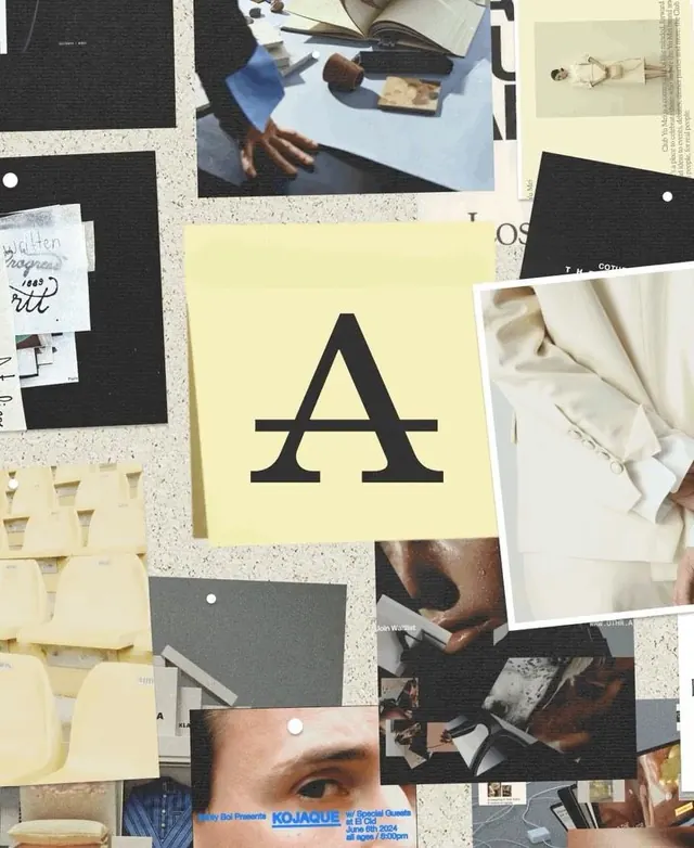
A designer's moodboard layering a large serif A letterform over textured card stock, fabric swatches, photography, and typography specimens in a warm neutral palette.
Summary
A designer's moodboard layering a large serif letterform (A) over scattered type specimens, fabric samples, photography, and card stock in warm neutrals and charcoal.
Visual description
A flat-lay composition with overlapping layers of design reference materials. The focal point is a cream-colored card with a bold, serif capital A in charcoal black, positioned center-left. Surrounding it are black card stock rectangles, off-white paper scraps with handwritten notes and type samples, neutral-toned fabric swatches, candid product photography showing hands working with textiles, and partial views of typography sheets. The color story is restrained: cream, beige, black, gray, and warm brown tones. Pin whites and soft shadows anchor the composition against a textured base (likely cork or terrazzo).
Key takeaway
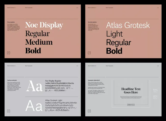
The discipline of a single large letterform as a focal point; the contrast between formal serif capitals and organic texture (handwriting, fabric); the muted color restraint (4-5 colors max) that reads as intentional, not accidental. This is how to show type pairing: juxtapose specimens directly rather than isolating them.
Reuse notes
Strong reference for brand identity decks, type presentations, or packaging design rationale. The handwritten notation reinforces the idea of human craft. Works especially well when paired with case studies showing the thinking behind type choices.