Preview image. Unlock full-res
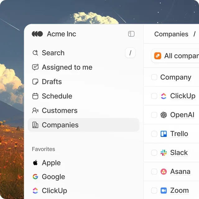
Productivity app sidebar with vertically stacked icon-labeled menu items, active state highlight, and a company/partner filter panel on the right.
Summary
A left-aligned sidebar navigation menu combining icon-labeled menu items with an active state treatment and a companion filter panel listing company integrations on the right.
Visual description
The left sidebar uses a clean white background with a left-justified header "Acme Inc" and a grid icon. Below, six menu items stack vertically, each pairing a left-aligned icon with right-aligned label text in sans-serif: Search, Assigned to me, Drafts, Schedule, Customers, and Companies (highlighted with a muted background). A "Favorites" section groups three company logos (Apple, Google, ClickUp). On the right, a secondary panel shows "Companies" as a heading and displays individual company cards as checkboxes with logos and names (ClickUp, OpenAI, Trello, Slack, Asana, Zoom). The background shows a subtle sky-and-cloud atmospheric image (out-of-focus, providing visual interest without competing for attention).
Key takeaway
The icon-label pairing pattern creates fast visual scanning without needing color. The active state (muted background highlight) is subtle but clear. Nested sections (main menu, then Favorites, then secondary filter panel) create hierarchy without visual noise.
Reuse notes
Standard for productivity apps and SaaS dashboards. Works well for tools with multiple workspaces, projects, or data silos. The secondary filter panel on the right pairs naturally with a main content area in between. Sidebar height can scale with more menu items; the pattern remains efficient.