Preview image. Unlock full-res
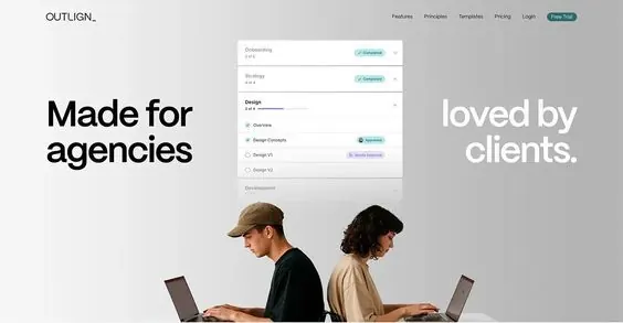
SaaS landing page hero with split-screen messaging emphasizing agency positioning, filter interface above, centered lifestyle imagery showing two people at work.
Summary
B2B SaaS hero section with bold split-column messaging, filter controls, and centered lifestyle photography anchoring the value proposition.
Visual description
A light-background SaaS interface layout with oversized sans-serif headlines "Made for agencies" (left-aligned in dark gray) and "loved by clients" (right-aligned in white text against light background). A filter or dropdown menu interface sits above, showing options like "Branding," "Pricing," and "Templates" with colored accent tags in teal and purple. Two people sit back-to-back at desks with open laptops, positioned centrally and photographed from the side, anchoring the middle section with authentic product-in-use context. The overall palette is neutral whites, light grays, and charcoal, with minimal color accents in the UI controls. Top navigation reads "OUTLOOK" with menu items: Features, Pricing, Templates, Pricing, Login, Get Started.
Key takeaway
The split-column headline pattern creating distinct value propositions for different audiences on one screen; the use of lifestyle photography centered between messaging rather than as a background; the minimal filter interface placed prominently to establish product capability without clutter; whitespace discipline allowing both text and image to breathe on the same viewport.
Reuse notes
Strong template for B2B SaaS launching to both agency and client audiences. The balanced messaging works well when your product solves for multiple buyer personas. The lifestyle photography grounds an otherwise abstract interface pitch with concrete social proof. Pair with one or two accent colors to avoid a sterile feel.