Preview image. Unlock full-res
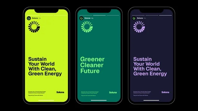
Three iPhone mockups displaying color variations of the Soluna renewable-energy app, using complementary lime green, teal, and deep navy to communicate sustainability messaging.
Summary
Three side-by-side iPhone mockups showcase the Soluna renewable-energy app across a bold color system, pairing bright lime green, teal, and deep navy to reinforce environmental messaging.
Visual description
Three iPhone 13/14 mockups stand in a row against a black backdrop, each displaying the Soluna app interface in a different color story. Left: lime-green (#C8F420) background with centered radial loading-spinner icon (sixteen-segment circular spinner) and bold headline "Sustain Your World With Clean, Green Energy" in dark sans-serif. Center: teal (#006D5B) variant with the same icon and copy structure, showing "Greener Cleaner Future" headline and a horizontal progress line below. Right: dark navy (#1A1B33) background with magenta/violet spinner and "Sustain Your World With Clean, Green Energy" in light purple text. Each phone displays the Soluna logotype bottom-right, subtle body copy and small icon line above it. The mockups use rounded-corner iPhone frames with visible speaker and bottom notch cutout. All three maintain identical layout and typography structure, emphasizing color-system consistency.
Key takeaway
The three-phone grid effectively shows a unified design system across color variants without repeating layout or content, allowing stakeholders to evaluate color impact instantly. The radial loading-spinner icon works as a focal point at multiple color temperatures. Using complementary hues (lime + teal) anchored by deep navy creates visual harmony while maintaining high contrast against text.
Reuse notes
Use when presenting color-system flexibility, theme variations, or dark/light mode combinations. Works particularly well for climate-tech, sustainability, and energy apps where color choice conveys brand promise. The animated-spinner icon suggests motion and progress, fitting for app onboarding or loading states.