Preview image. Unlock full-res
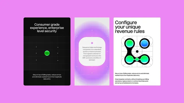
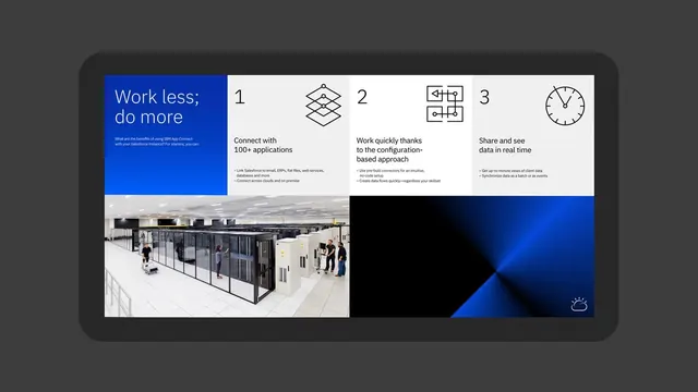
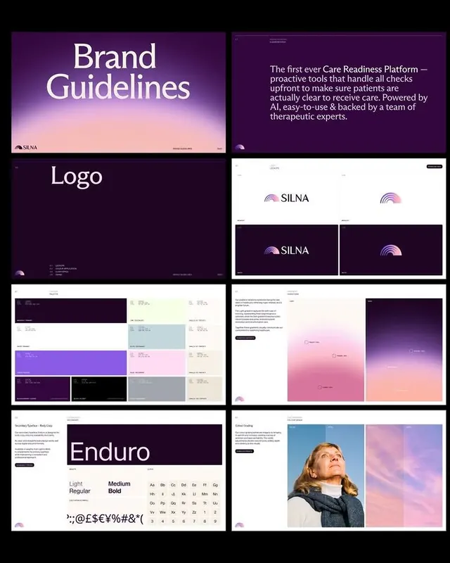
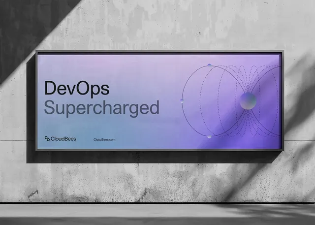
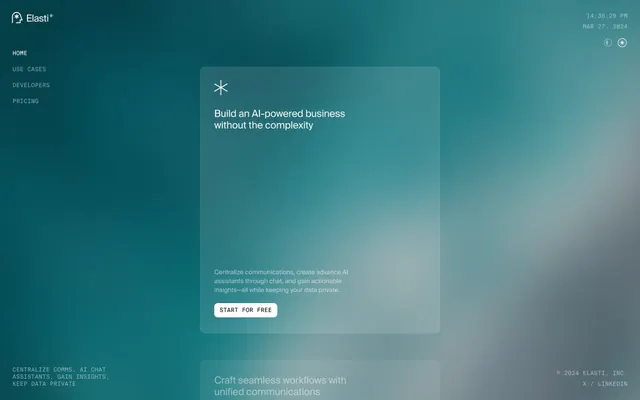
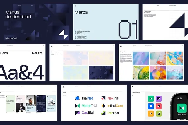
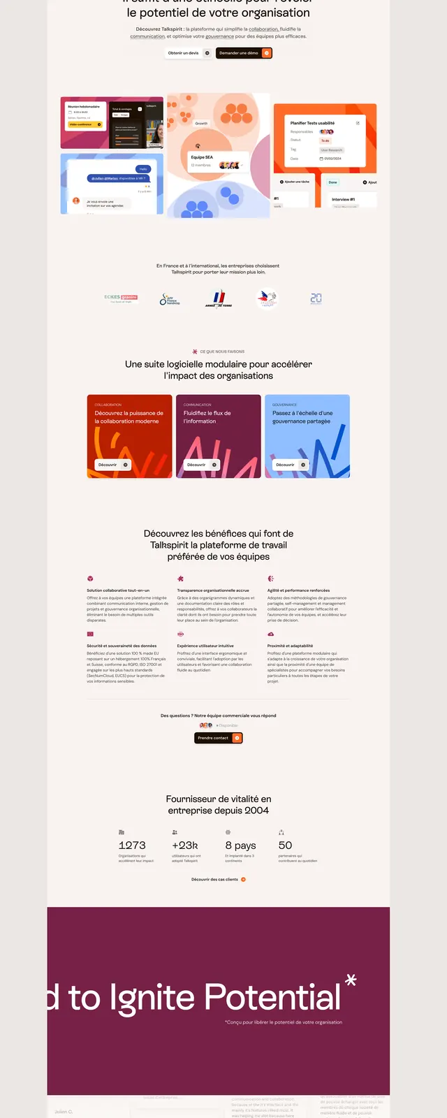
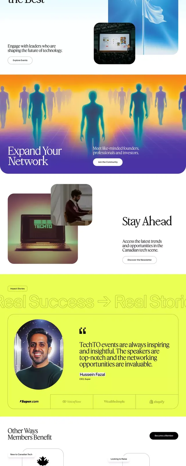
A comprehensive UI system showcasing 12 stacked screens with cool blue and deep purple backgrounds, punctuated by neon yellow accents and clean sans-serif typography.
Summary
A stacked UI kit showing 12 distinct screen variations with cool blue-to-purple gradients, neon yellow buttons and accents, and consistent card-based layouts across different content types.
Visual description
Composite of 12 mobile and web UI screens arranged in a tall vertical stack. Most screens are anchored to dark navy or deep purple backgrounds with smooth linear gradients, softening toward lighter blue-grey on some cards. Bright neon yellow serves as the primary CTA color and accent element. Screens include data tables with bordered rows, article lists with image previews, metric cards showing stats, empty states, and form-like layouts. All text is set in clean sans-serif with clear hierarchy: larger headlines (white or light grey), smaller body copy, and subtle secondary labels. White cards and light grey dividers provide visual separation on dark backgrounds.
Key takeaway
The neon-yellow-on-dark strategy for CTAs creates maximum clickability without harshness. The consistent card-based grid system works across 12 different content types (metrics, lists, tables, forms) without feeling repetitive. Gradient backgrounds on dark screens feel premium without requiring photography.
Reuse notes
Strong template for B2B SaaS dashboards, analytics products, or admin interfaces. The cool palette reads technical and trustworthy. Works well for user-generated-data contexts where you need clear hierarchy and scannable layouts. The gradients work only on dark backgrounds.