Preview image. Unlock full-res
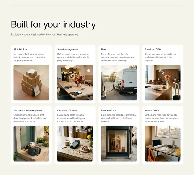
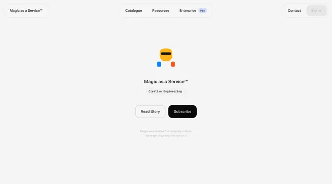
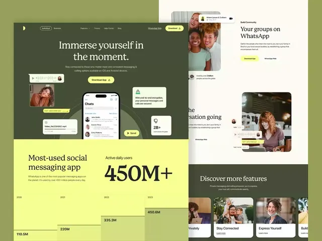
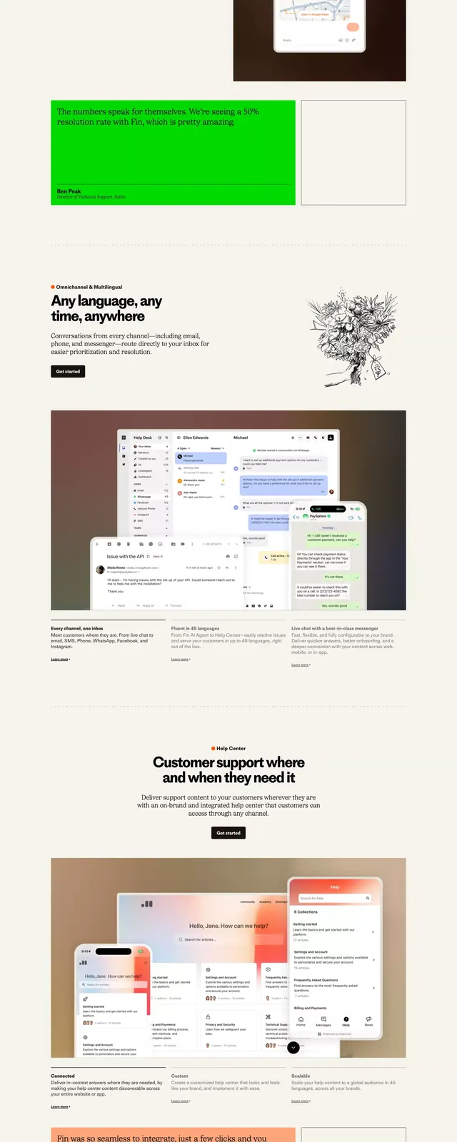
Vertical system showcase of a service platform UI with modular card layouts, color blocks, and information-focused interface states.
Summary
Vertical design-system mockup showcasing modular interface patterns for a service platform, with color swatches, card layouts, forms, and imagery arrangements stacked for documentation reference.
Visual description
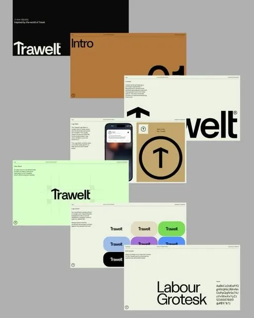
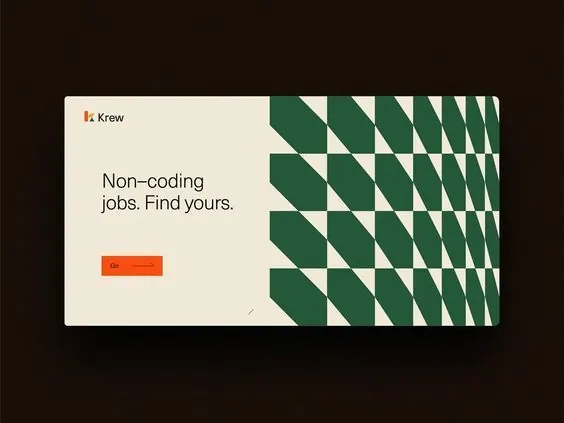
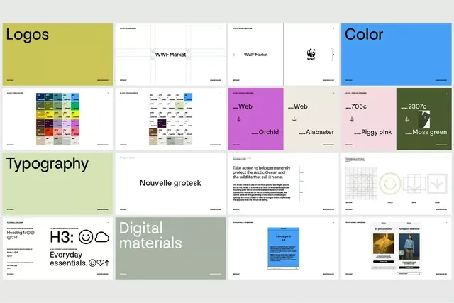
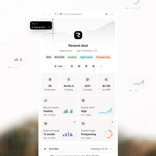
Seven sequential panels flowing downward: top panel displays color swatches and a green accent block; second shows a mobile phone mockup on a white background; third presents a dark form card with white text; fourth displays an orange banner with illustration imagery; fifth shows a grid of interface cards in white with muted text and small imagery; sixth contains a map section and typography documentation; bottom panel features a vibrant tropical illustration with a dark sidebar showing a color palette. Each section uses white space to separate concerns and demonstrates a different UI pattern or component state.
Key takeaway
The stacked, documentation-forward layout that treats every interface module as a distinct design specimen, making it clear how components behave in isolation. Restrained use of two accent colors (green and orange) to guide hierarchy without overwhelming neutral content. The pairing of illustration assets with structured UI components to show how visual elements integrate.
Reuse notes
Ideal for designing and documenting service-focused B2B or SaaS platforms where users navigate multiple information-dense screens. The neutral, earthy palette feels approachable and trustworthy. Works as a presentation deck or internal design guide. The modular structure is easily adapted for other product categories.