Preview image. Unlock full-res
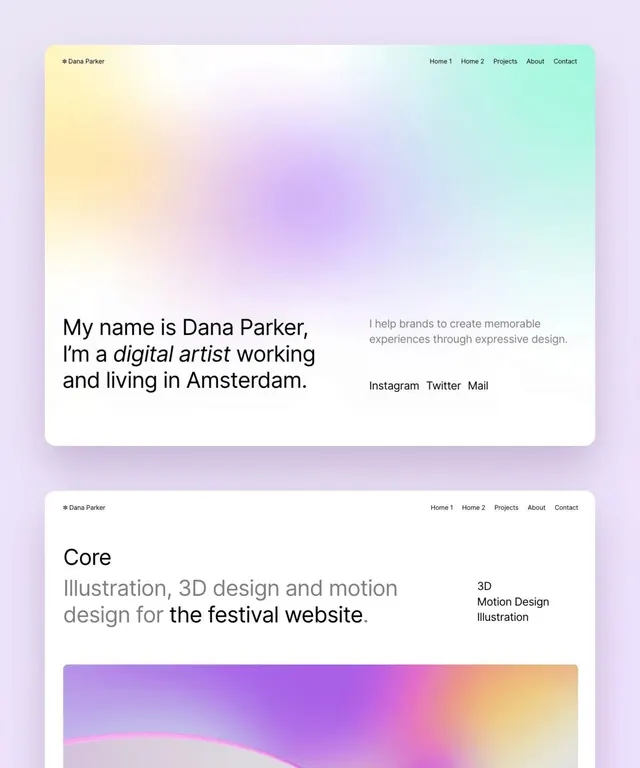
A designer portfolio featuring a soft multi-color gradient background (lavender to mint) with clean horizontal navigation and large mixed-weight text introducing the creator and services.
Summary
A designer portfolio landing page with a flowing soft gradient backdrop (lavender to mint), featuring large typography mixing roman and italic weights to introduce the creator's work and service offering.
Visual description
Two stacked card layouts over a soft gradient background that shifts from pale yellow (top left) through lavender and cool mauve to mint green (right). Top card has "Dana Parker" logo and main navigation (Home 1, Home 2, Projects, About, Contact) in small sans-serif on a semi-opaque light background. Large introductory text reads "My name is Dana Parker, I'm a digital artist working and living in Amsterdam" with "digital artist" set in italic. A secondary column describes the service: "I help brands to create memorable experiences through expressive design." Social links (Instagram, Twitter, Mail) sit below. Lower card shows a project labeled "Core" describing "Illustration, 3D design and motion design for the festival website" with accent tags "3D", "Motion Design", "Illustration" and a colorful gradient shape beneath suggesting the project's visual character.
Key takeaway
Use a soft, analogous gradient background to create cohesion without competing with text. The italic/roman type pairing (same word family, different slant) adds visual interest and emphasis without adding font weight or color. Card-on-gradient layouts create perceived separation and hierarchy without hard borders. Combining project tags with a brief context line (not just a list) makes the work feel grounded.
Reuse notes
Ideal for design/creative portfolios, freelance designer sites, or any creator-centric landing page. The gradient-background approach works on smaller viewports without looking cluttered. The type pairing works best when italic and roman are from the same family and there is breathing room around the text. Consider using this pattern when presenting individual client projects or services rather than dense project grids.