Preview image. Unlock full-res
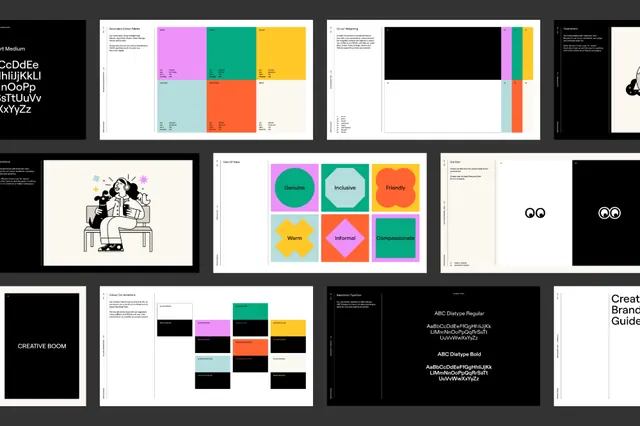
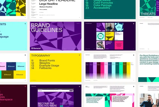
A comprehensive brand-system specimen featuring geometric layouts with bold purple, teal, and yellow color blocks, demonstrating type scales, color guidelines, and modular composition rules.
Summary
A multi-page brand-guideline system specimen for Gunsul featuring bold geometric layouts and a structured color system with deep purple, teal, and bright yellow accents.
Visual description
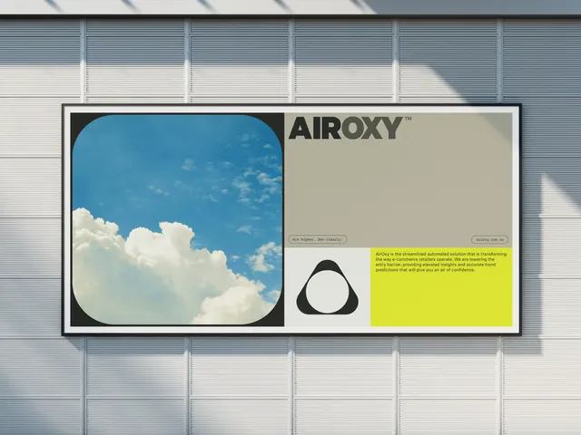
The image shows a grid of brand-system pages arranged on a light background. Key spreads include: a display-headline specimen with large serif typography on a teal background (left); a color-pairing and accessibility guidelines section listing numbered color names (center-top); a brand-guidelines cover with layered purple geometric shapes and overlapping semi-transparent panels (center); a modular color-palette and imagery rules grid showing how images layer over colored backgrounds (right); a bold yellow typography page with numbered font weights and fallback guidance (bottom-left); and various pattern and component usage examples showing how the geometric shape system applies to layouts and photography cutouts (bottom-right).
Key takeaway
The geometric-shape system serving as both visual texture and modular layout guide; the pairing of light backgrounds with bold, solid color blocks for maximum contrast and legibility; the clear hierarchical structure using colored sections to separate guideline topics from one another.
Reuse notes
Perfect reference for designing comprehensive brand systems that need strong visual structure without overcomplication. The pure geometric language works equally well in print and digital contexts. Best paired with brands needing confident, sophisticated visual identity systems.