Preview image. Unlock full-res
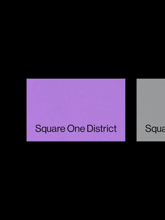
Minimalist two-column layout with large vibrant purple and neutral gray rectangular blocks on black, using only text and solid color fields for emphasis.
Summary
Minimalist two-column layout with large vibrant purple and neutral gray rectangular blocks on black, using only text and solid color fields for emphasis.
Visual description
Black background with two vertical rectangular blocks positioned center-right: left block is bright violet/lavender (#B37DDB) containing centered sans-serif text "Square One District" in black; right block is cool neutral gray containing partial text "Squa..." (cut off at frame edge). Solid color fields dominate, with no imagery, decoration, or additional UI elements. The contrast between the saturated purple and muted gray creates visual separation while maintaining a cohesive, restrained palette. Text placement and block proportions suggest a split-screen or two-column navigation concept.
Key takeaway
The clarity of using only large color blocks and sans-serif text to create a complete UI layout with zero visual noise. The purple-to-gray color pairing provides enough contrast to read as distinct sections without being chaotic. Stripping away all non-essential UI elements (borders, shadows, icons) lets color and typography carry the entire design.
Reuse notes
Effective for minimal portfolio sites, directional screens, or navigation interfaces where two clear options need equal weight. Works well as a concept landing page or section divider. The vibrant purple reads as a primary action or featured state; the gray suggests secondary or neutral. Avoid in data-heavy or information-dense contexts where solid blocks would feel too restrictive.