Preview image. Unlock full-res
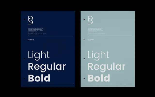
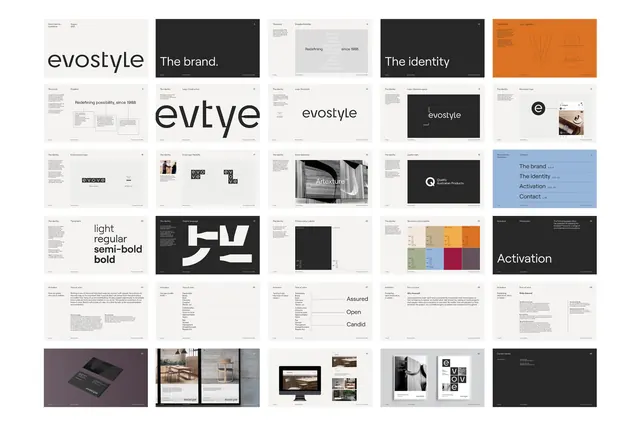
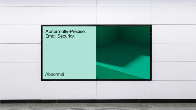
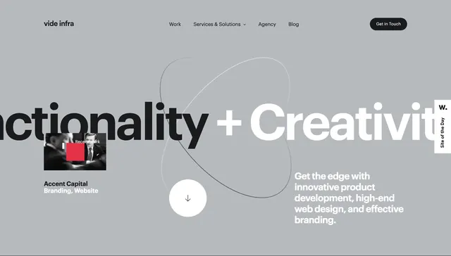
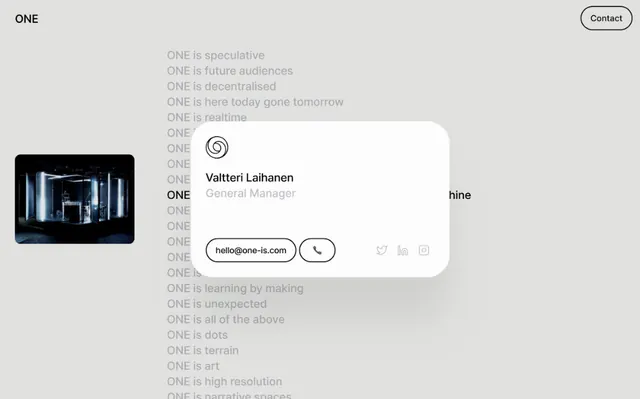
The design employs a clean, minimalist aesthetic dominated by neutral tones and ample whitespace to emphasize the text-based content.
Summary
The design employs a clean, minimalist aesthetic dominated by neutral tones and ample whitespace to emphasize the text-based content.
Visual description
The design employs a clean, minimalist aesthetic dominated by neutral tones and ample whitespace to emphasize the text-based content. The visual hierarchy is strong, using typography and a focused white card to highlight key contact information against a subdued background. The composition uses a vertical grid structure, balancing textual lists with a prominent centered card and an asymmetrical placement of visual elements. A simple, clean sans-serif typeface is used consistently throughout, prioritizing readability and modern simplicity.
Key takeaway
An ui screen reference. Worth saving for its minimalism, sans-serif, corporate treatment.
Reuse notes
Fits agency work.