Preview image. Unlock full-res
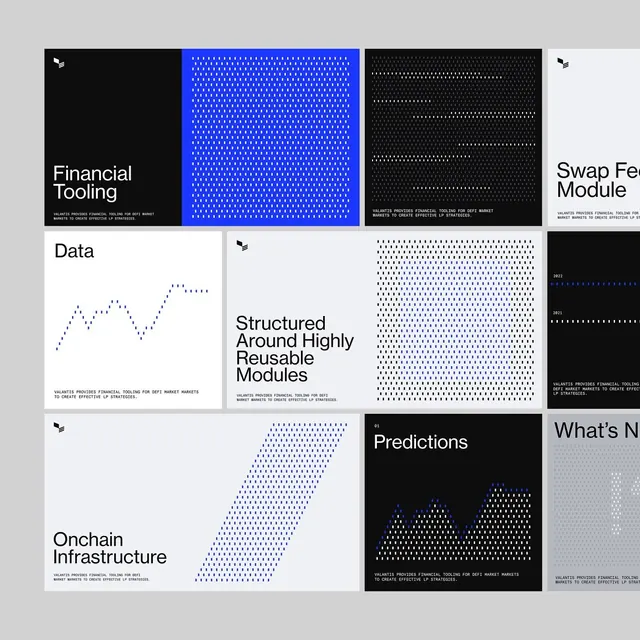
A dashboard-style grid of financial technology modules showing service categories like Data, Predictions, and On-chain Infrastructure, illustrated with abstracted dot and line patterns.
Summary
A financial platform interface using a bento-grid layout of unequal modules, each representing a service category (Financial Tooling, Data, High-Fidelity Design, Swap Fee Module, Structured Modules, Onchain Infrastructure, Predictions) and filled with abstract geometric dot and line visualizations.
Visual description
Light gray background with grouped cards in white and deep black sections. Grid layout mixes variable-sized rectangles in a bento arrangement. Each card pairs a service title (bold sans-serif on left or center) with an abstract visualization filling the remaining space: dotted fields of repeated dots in blue or white, flowing diagonal line patterns, or stylized graphs (chart lines shown as dotted paths). Top strip shows three preview cards (black, solid blue dot field, black with white dots). Lower section contains five larger modules at different aspect ratios, creating visual rhythm. Black cards feature white or blue dots, white cards contain blue accents and monochromatic dot patterns. Minimal borders, clean typography anchoring top-left of each module.
Key takeaway
Using abstract dot fields and line patterns as lightweight data imagery instead of rendered charts. Bento grid (variable-sized cards) creates visual interest while maintaining order. High contrast between black, white, and electric blue reads as modern fintech without heavy imagery.
Reuse notes
Ideal for financial platforms, crypto dashboards, or data science applications needing to convey multiple features at once. Dot patterns work well at small sizes for previews or at large scale for feature showcases. Not suitable for displaying actual real-time data values; best for categorical service menus.