Preview image. Unlock full-res
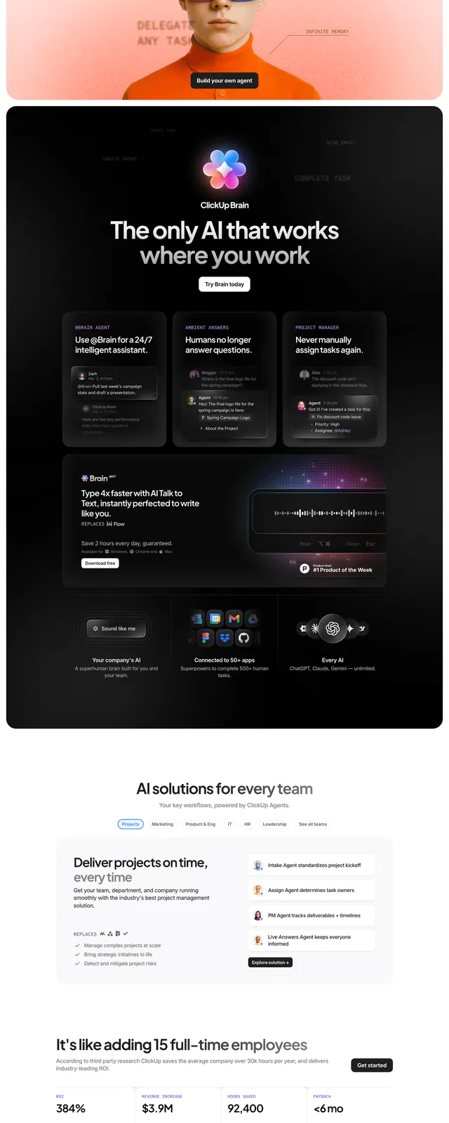
A long-scroll AI productivity SaaS landing page with alternating light and dark sections covering hero, integration grid, dark AI spotlight, feature modules, social proof, and a dashboard screenshot closer.
Summary
A long-scroll AI productivity SaaS landing page that sequences a white hero with oversized headline, a full-bleed integration logo grid, a dark AI spotlight section, stacked feature modules, video testimonials, and a final dashboard-screenshot CTA -- demonstrating a complete multi-section content strategy.
Visual description
The image is a compressed full-page scroll of a light-mode SaaS landing page with one major dark section break. From top to bottom: (1) White hero with a large left-aligned headline ("Maximize human productivity"), a sub-headline citing "40% of human work is lost in context," and small service-category pills below. (2) A dense logo/icon grid listing integrations and AI agents (recognizable app icons including Figma, Notion, and others) arranged in a flowing multi-row grid on white. (3) A dark near-black full-width section with a centered AI-branded mark, a headline ("The only AI that works where you work"), and a card grid of dark rounded feature tiles with icon labels. (4) Back to white with alternating left/right feature modules ("AI solutions for every team," "Define projects in time") showing short bulleted benefit lists. (5) A muted green-gray section with a headline ("If it's like adding N full-time employees") and associated metrics. (6) A "Loved by 13 million+ teams" section with three circular avatar testimonial cards and company logos (including one recognizable automotive brand). (7) A wide full-width dashboard screenshot showing a calendar or task manager interface with a sidebar, colored task bars, and a mobile companion view at far right. Body copy throughout is compact sans-serif; accent color appears to be a muted orange-red used sparingly for a pill/badge in the hero.
Key takeaway
The alternating light/dark section cadence creates natural chapter breaks without relying on color themes per section -- the dark AI spotlight does the heavy lifting of separating product tiers. The integration logo grid used as a standalone section (not a buried subsection) signals ecosystem breadth immediately and doubles as social proof. The compressed full-page scroll format itself is reference-worthy for planning SaaS page architecture: hero, proof, capability, feature depth, social proof, close.
Reuse notes
Use this as a structural blueprint for a comprehensive SaaS landing page, particularly for AI or productivity tools targeting teams. The multi-section cadence (hero > integrations > dark spotlight > features > testimonials > dashboard CTA) is repeatable and can be adapted section by section. The dark spotlight section is most effective when the product has a single "hero" AI feature to dramatize. Dashboard screenshots in the closer section require a genuinely polished UI to avoid undermining the page.