Preview image. Unlock full-res
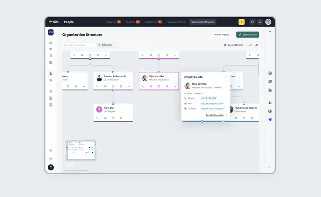
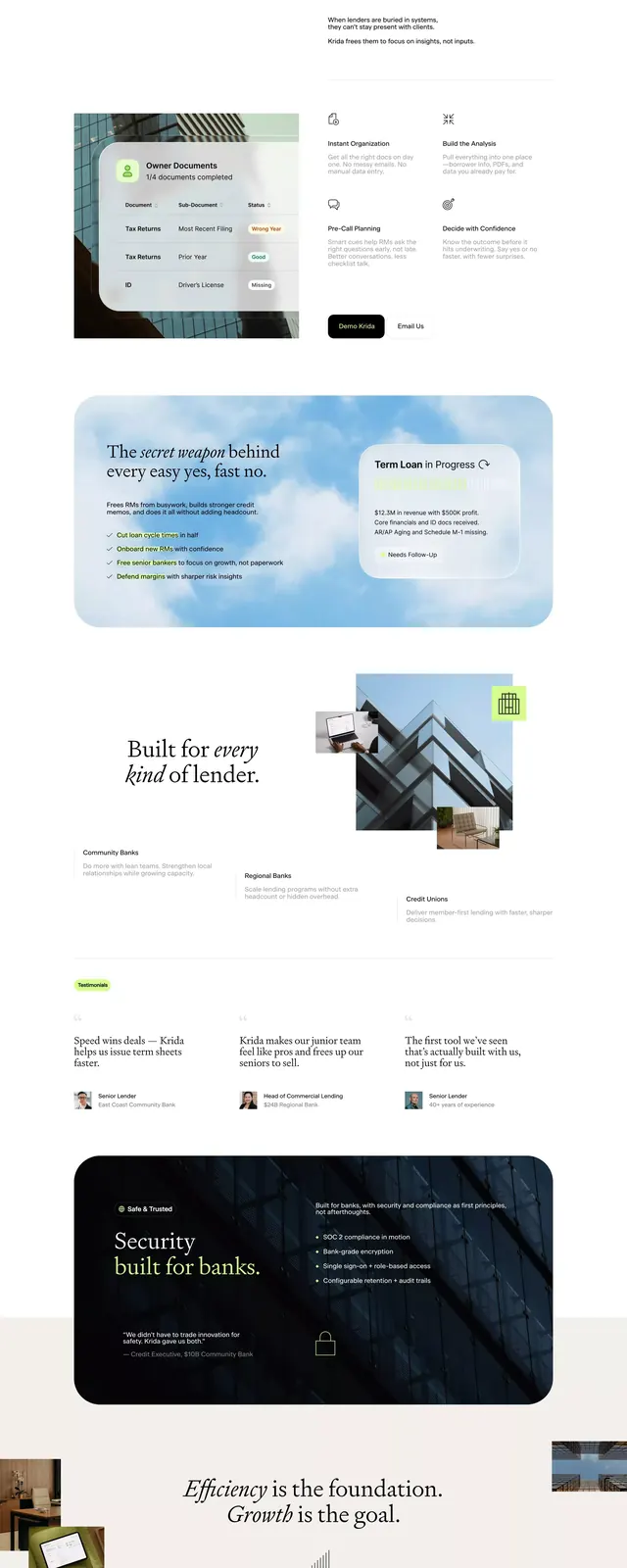
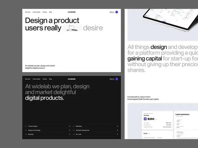
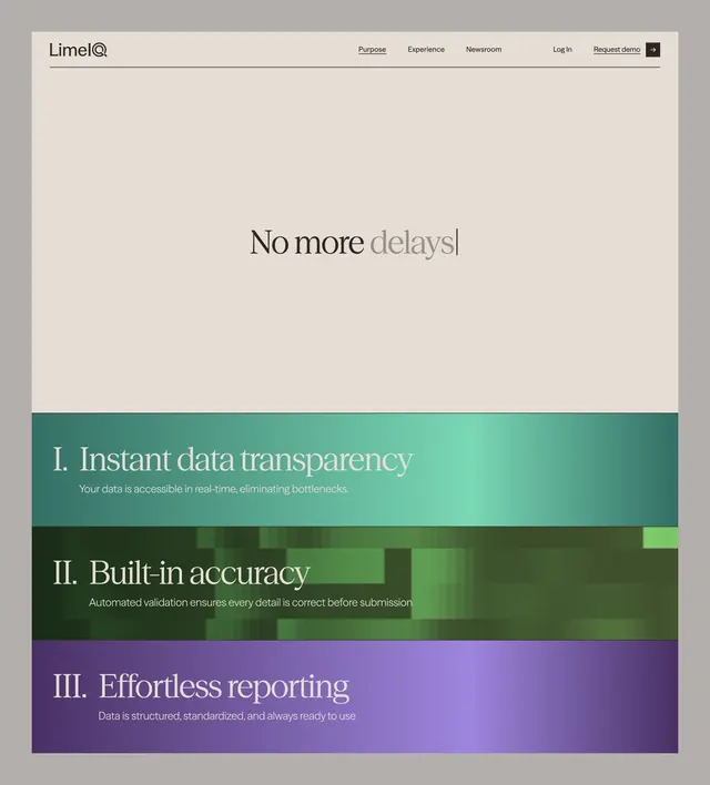
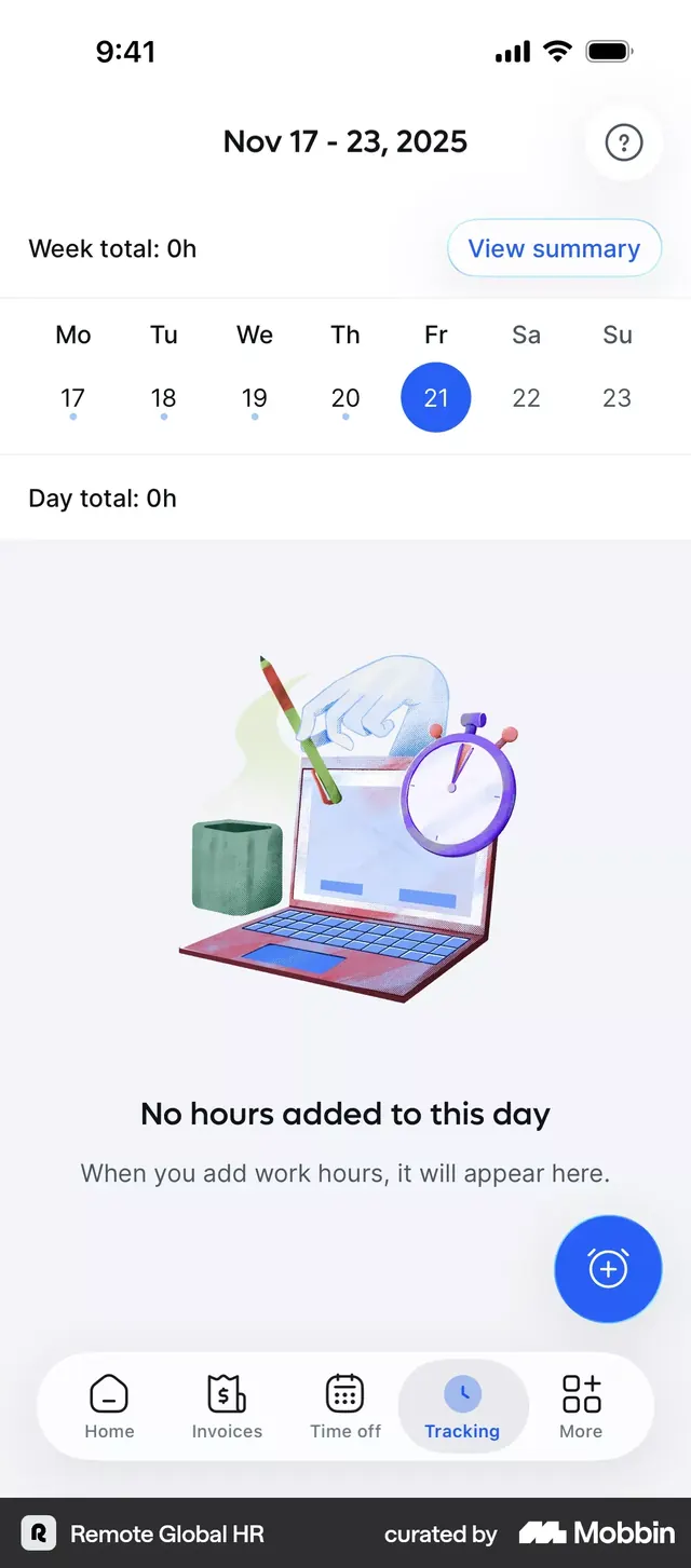
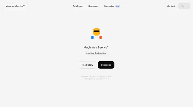
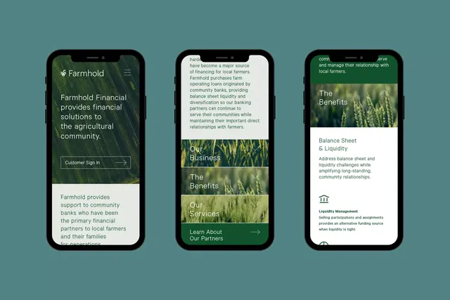
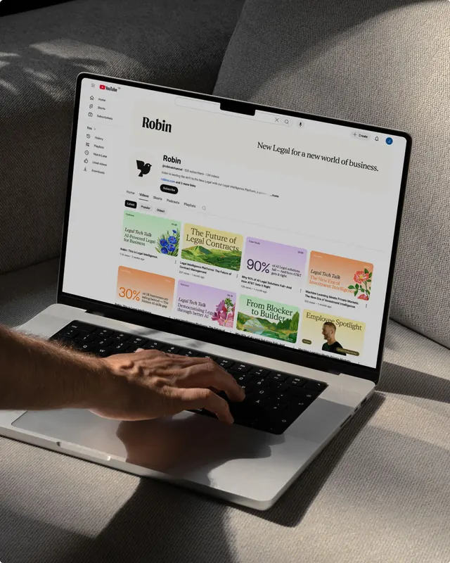
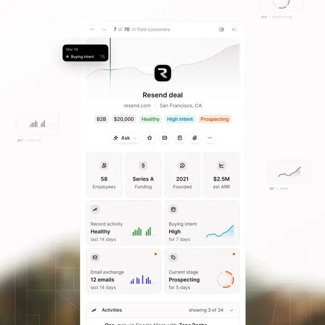
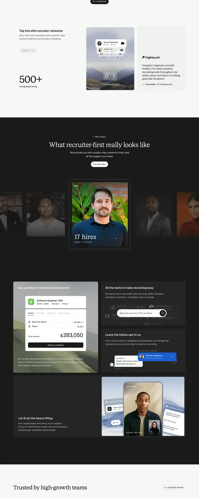
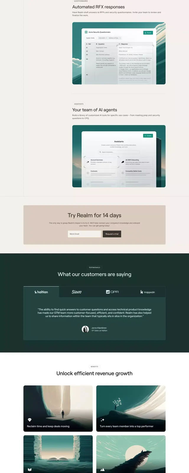
Full-page vertical layout for a SaaS product site using deep teal accents, modular card grids, testimonial hero photos, and alternating section layouts in muted cool tones.
Summary
A full SaaS marketing site stacked vertically, using cool-toned teal and muted-gray cards with generous whitespace to present features, case studies, and testimonials in a serene, organized grid system.
Visual description
A long-form site layout in cool teals and muted grays on off-white. The top features a hero section with a large product image and teal accent bar. Below: multiple card-based sections showing features and benefits in organized 2-3 column grids, with icons and short-form text. Mid-page, case study cards display product screenshots, metrics, and testimonial quotes with small avatar photos. A sidebar or secondary navigation appears throughout. Typography relies on clean sans-serif across headline and body copy. Sections are separated by generous horizontal spacing and subtle teal dividers. The bottom includes a footer with links and social icons.
Key takeaway
The teal accent bar anchors the otherwise neutral palette without screaming. Card-based layouts in short bursts (2-3 sections at a time) prevent monotony while maintaining calm. Testimonial cards pair a screenshot with a quote and small face photo, validating the claim with evidence.
Reuse notes
Ideal for SaaS platforms wanting to feel calm and organized rather than aggressive. The muted cool palette suits design tools, productivity apps, and B2B services. Works well for audience with multiple roles (admin, user, manager) because the sections can target each separately. Avoid on high-energy or consumer products.