Preview image. Unlock full-res
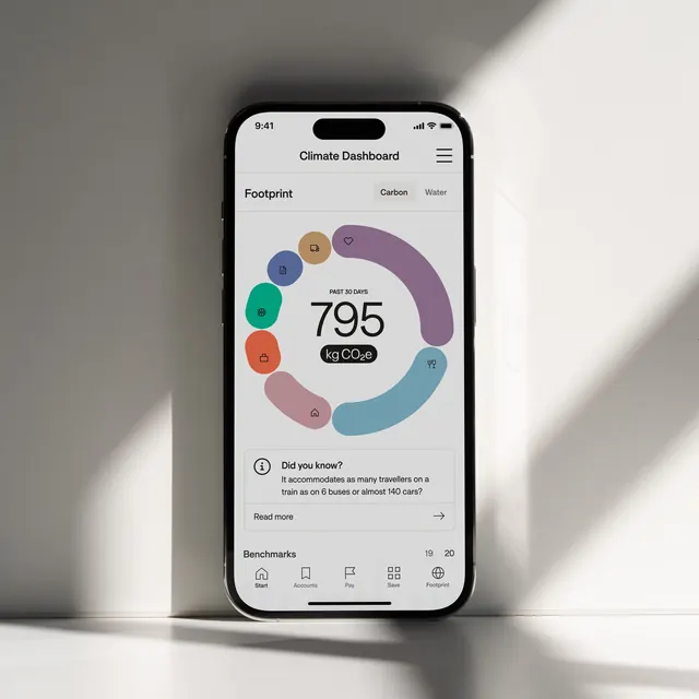
Sustainability-focused mobile app interface displaying a carbon footprint tracker with circular progress visualization and environmental data.
Summary
A mobile app interface for a climate-tracking application showing a carbon footprint dashboard with circular progress chart, environmental metrics, and educational content.
Visual description
The app screen displays "Climate Dashboard" at the top with tabs for Carbon and Water footprint tracking. A large circular progress ring in pastel colors (purple, blue, teal, coral, rose) shows "795 kg CO2e" as the metric. Small icons around the ring represent different categories (transport, energy, shopping, home). Below is a "Did you know?" educational callout section with sustainability facts and a "Read more" link. Bottom navigation provides access to Saves, Bookmarks, Pay, Portfolio, and other sections. The overall design uses a minimal, earthy color palette with gentle shadows.
Key takeaway
The circular chart simplifies complex environmental data into an intuitive visual form. The pastel color coding makes heavy data feel approachable rather than guilt-inducing. Educational elements balance accountability with encouragement.
Reuse notes
Excellent for fintech, sustainability, health tracking, or productivity apps. The circular visualization pattern works for any metric-tracking interface. The earthy, calm palette is appropriate for climate-conscious brands and environmental impact measurement tools.