Preview image. Unlock full-res
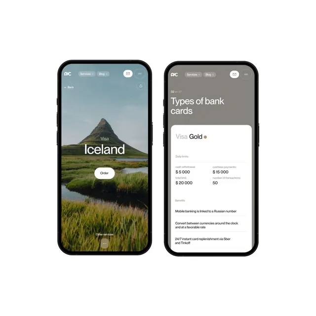
Mobile app interface design showing two screens: a scenic Iceland landscape hero with call-to-action, and a financial product details card with pricing and features.
Summary
A mobile application UI design for a banking platform showing two complementary screens: a hero screen featuring an Icelandic mountain landscape with "Order" button, and a product details screen displaying "Visa Gold" card information with limits and features.
Visual description
Two iPhone mockups are displayed side-by-side. The left screen features a full-screen landscape photograph of a dramatic Icelandic mountain (Kirkjufell) with calm water and marshland. Text reads "Iceland" overlaid on the image, with a white "Order" button centered below. The right screen shows a product information layout on a light gray background. A navigation header reads "Types of bank cards" with "Visa Gold" highlighted below. White card displays list pricing tiers (Daily limits $5,000, Monthly $15,000) and transaction counts (50 transactions). Benefits text below explains features like mobile banking, currency conversion, and card replacement services. Both screens use clean sans-serif typography in black and white.
Key takeaway
The combination of hero imagery and practical product information creates a compelling user journey. The scenic landscape on the first screen establishes emotional appeal, while the second screen provides rational product details. The minimalist layout makes complex financial information accessible and trustworthy. White space and careful typography hierarchy guide the user through the flow.
Reuse notes
Strong reference for fintech app design, particularly banking or investment applications. Excellent for product marketing flows that balance emotional appeal with practical detail. The hero + details pattern is replicable across many product categories. The minimalist aesthetic works well for premium financial services. The color palette of muted tones with strategic white space conveys stability and trust. Works well for mobile-first design systems and responsive layouts. Avoid using for consumer-facing casual applications where approachability and warmth might be more important than precision.