Preview image. Unlock full-res
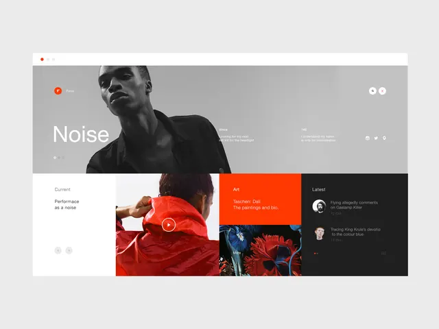
A responsive portfolio webpage featuring a stark three-section grid layout with grayscale hero, vibrant red accent section, and dark sidebar navigation.
Summary
A contemporary portfolio website layout with a monochromatic hero banner, grid of project cards, and a striking red accent panel isolating featured work, featuring artistic photography and bold typography.
Visual description
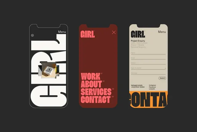
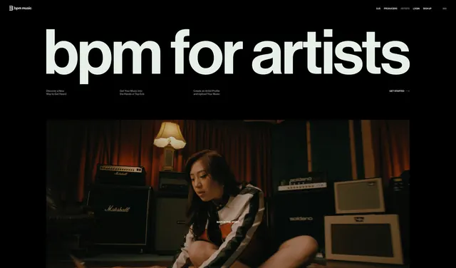
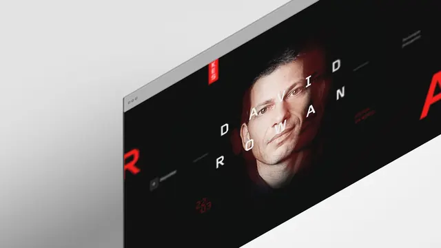
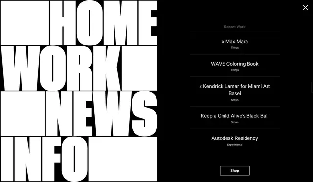
Top section features a large grayscale portrait photograph with the headline NOISE in white sans-serif, maintaining visual hierarchy through size and position. A browser chrome mockup shows a light gray background containing three zones: the hero photo area left, a bright red featured project card center, and a black sidebar right containing social links and recent comments. The layout uses generous spacing and a three-column grid for content below the hero, mixing photographic imagery with typography overlays.
Key takeaway
The power of one accent color in an otherwise neutral palette to draw attention and create emotional impact. Grid-based layouts paired with bold imagery create modern, scannable interfaces.
Reuse notes
Perfect for artist portfolios, photography sites, creative agencies, and contemporary design studios. The three-section pattern scales well responsively. The red accent technique is effective for calls-to-action or featured projects without overwhelming the design.