Preview image. Unlock full-res
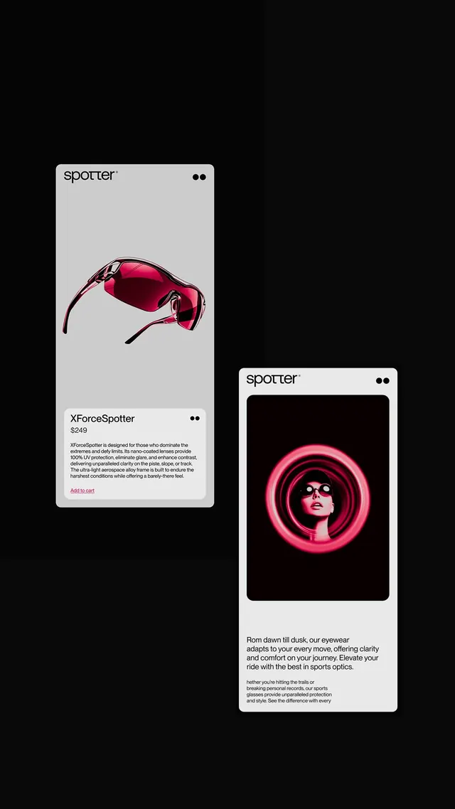
Two-screen mobile product showcase for a sports optics brand, pairing a technical spec card with vibrant neon-pink lifestyle imagery against a black background.
Summary
Two-screen mobile product showcase for a sports optics brand, pairing a technical spec card with vibrant neon-pink lifestyle imagery against a black background.
Visual description
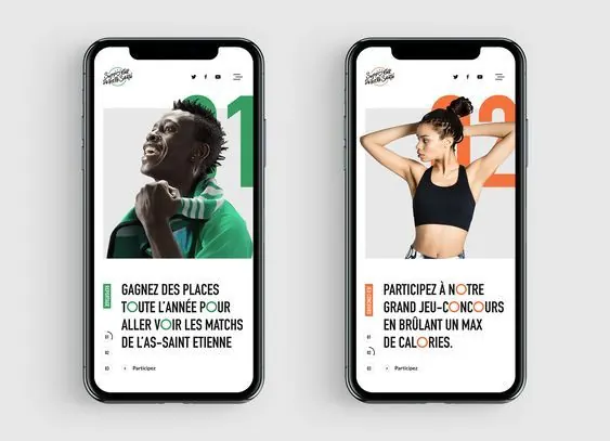
Left screen shows a light gray card with the "Spotter" logo and menu dots at top, a large centered image of hot-pink wrap-around sunglasses viewed straight-on, a product name "XForceSpotter" in sans-serif with a "$249" price, a paragraph describing technical specs (UV protection, anti-glare, durability), and a red "Add to cart" text link at the bottom. Right screen shows the same light header area, but the main content is a bold lifestyle image: a woman's face in profile framed by concentric circles of neon pink light rings on pure black. Below is marketing copy describing the product benefits (clarity, comfort, moving conditions). Both cards have rounded corners and subtle drop shadows, clearly set apart from the pure-black background.
Key takeaway
The contrast pairing: functional, text-dense product specs on one side, emotionally charged lifestyle imagery on the other. Neon pink on black creates urgency and luxury simultaneously without being garish. Large hero imagery as a separate screen view rather than cramming everything into one card. The "$249" and small paragraph of technical detail lend credibility to the premium positioning.
Reuse notes
Strong for luxury or performance-driven sports/outdoor products where emotional lifestyle imagery matters as much as spec details. Works especially well for eyewear, apparel, and small high-value goods. The two-screen layout suits mobile experiences where users can swipe between "what is it" and "why should I want it". Not suitable for budget or mass-market categories where the premium mood would ring false.