Preview image. Unlock full-res
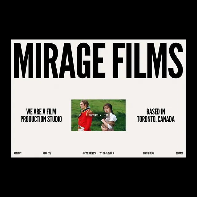
Mirage Films website header featuring bold all-caps serif type over white, a centered film still, and navigation footer on stark black background.
Summary
Mirage Films website header featuring bold all-caps serif type over white, a centered film still, and navigation footer on stark black background.
Visual description
A full-screen hero with stark black letterbox borders framing a white central panel. Large serif typeface in all-caps reads "MIRAGE FILMS" at the top. Below, three columns of text: left reads "WE ARE A FILM PRODUCTION STUDIO", center displays a color photograph of two people in period costume against green landscape with a "WATCH REEL" play button overlay, right states "BASED IN TORONTO, CANADA". Bottom footer lists navigation items: "ABOUT US", "WORK (21)", coordinates, "NEWS & MEDIA", "CONTACT" in serif type. Composition is perfectly centered and symmetrical.
Key takeaway
The restraint of black-white contrast with minimal color accents (the green of the photo background acts as a subtle complement). The serif typeface in all-caps conveys authority and editorial intent. Centering everything creates formality and forces the eye to the photograph, making the image the hero.
Reuse notes
Ideal for film, production, or editorial studios where photography is the asset. The bold symmetry works best when you have a strong central image. The black frame reads as a gallery aesthetic; best suited to industries valuing craft and intentionality (media, luxury, creative services).