Preview image. Unlock full-res
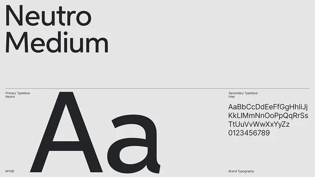
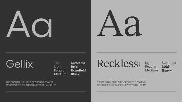
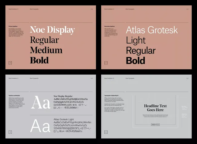
Structured four-panel typographic specification guide presenting two serif-and-sans pairs with weight hierarchy, character sets, and usage rules.
Summary
Brand typography guide displayed as a four-panel grid, showcasing serif and sans-serif typefaces with their weights, character sets, and heading-placement guidelines on a warm beige background.
Visual description
Two-by-two grid on a warm muted-pink background: top-left panel displays Noe Display in white, stacked in Regular, Medium, and Bold weights; top-right shows Atlas Grotesk Light, Regular, and Bold in white; bottom-left presents full character sets and font-combination examples for both typefaces in smaller sizes on light background; bottom-right illustrates a heading usage scenario with placeholder text. Each panel is bordered and numbered, with metadata labels at the top (Brand Guidelines 1.3 / Brand Typography). The warm background creates visual unity while the white type and dark alternatives maximize contrast for readability demonstration.
Key takeaway
The pairing of display examples with character set specimens and live usage mockups, all in one cohesive spread. Using background color (warm beige) as both a branding signal and a readability tool for light type. The clear weight progression showing each typeface's available variations in a single glance.
Reuse notes
Essential reference for brand guidelines, design-system documentation, or type-foundry catalogs. The format is self-contained and presentation-ready. Works well for serif-and-sans pairings where contrast is desired. The warm background color would pair with editorial, luxury, or creative industry brands; adapt for different color schemes as needed.