Preview image. Unlock full-res
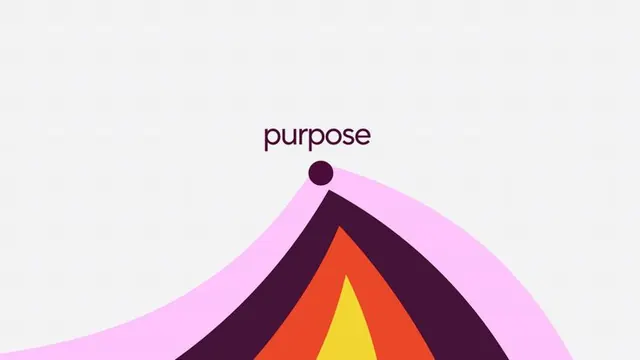
Layered, flowing gradient shapes in warm tones (pink, orange, yellow, deep purple) form an upward-pointing mountain or peak, anchored by the word 'purpose' in serif type.
Summary
Layered gradient shapes in warm tones (magenta, orange, yellow, deep purple) form a mountain peak ascending from the lower left, paired with the text "purpose" in a clean serif font.
Visual description
Soft, flowing gradient shapes stack diagonally to create a peak composition. Layers progress from pale magenta (bottom left) through a warm pink, a chunky dark purple band, vibrant coral-red, and bright yellow at the apex. A small dark purple circle floats near the type, acting as a dot marker or accent. "Purpose" is set in a modern serif typeface, positioned at top center in deep purple-brown. The background is light, off-white gray. Curves are smooth and organic, with soft edge transitions between color bands creating a felt sense of depth.
Key takeaway
The layered gradient technique using warm analogous colors to create directional movement (upward) and energy without using actual shapes or strokes. The small accent circle that echoes the word's letterforms. The use of serif type paired with abstract, organic forms for a contemporary, premium feel. The warm-to-warm palette that feels both playful and serious.
Reuse notes
Ideal for inspirational or aspiration-driven branding (wellness, coaching, productivity apps, nonprofit missions). The peak metaphor works well for achievement or growth narratives. The warm palette reads friendly yet premium, suit for consumer apps or lifestyle brands. Scale well to hero sections and social media; the composition is strong enough to hold attention without text or secondary elements.