Preview image. Unlock full-res
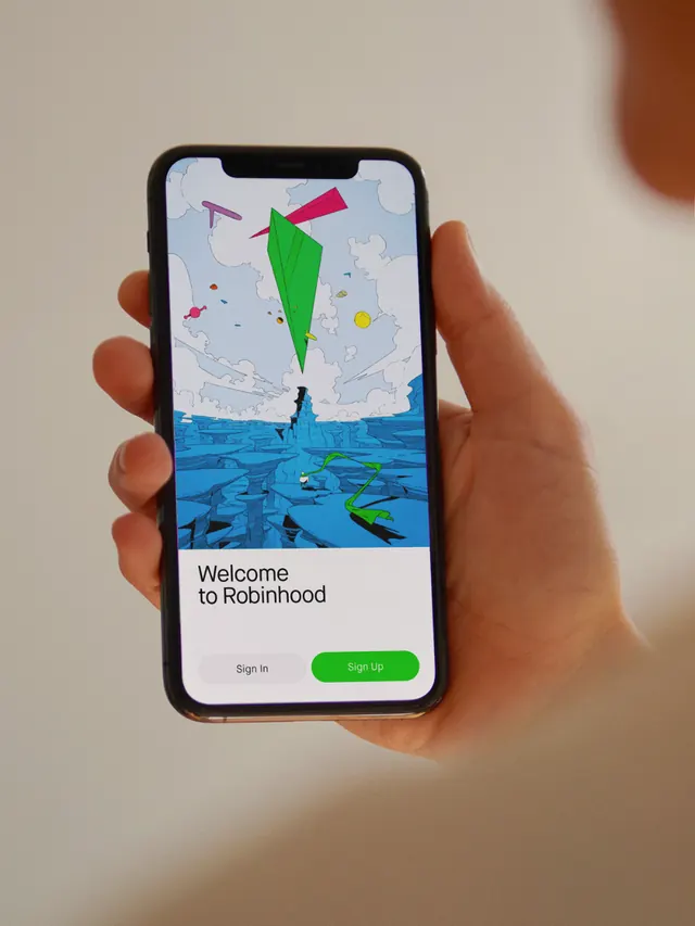
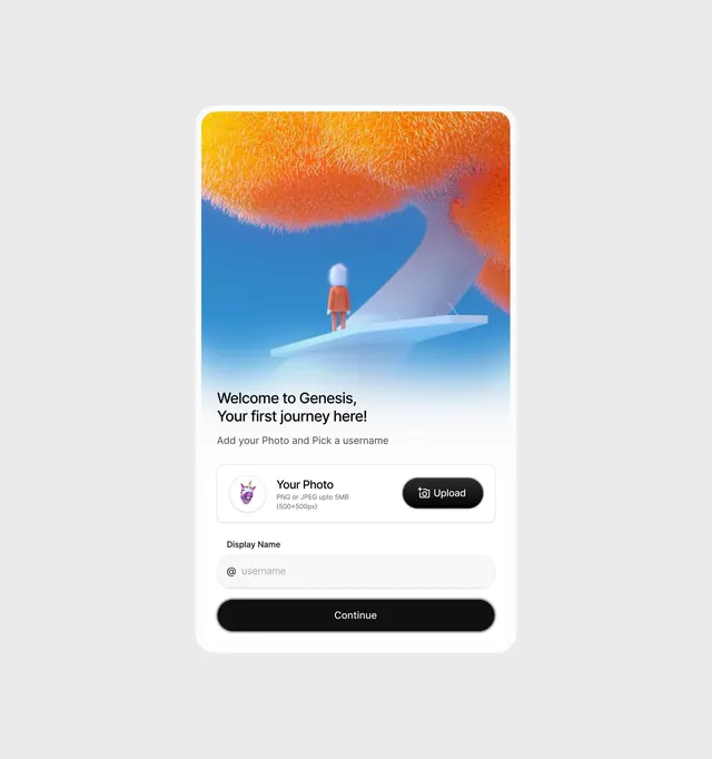
Mobile onboarding screen with warm orange-to-blue organic gradient, illustrated figure, and white form card for profile setup.
Summary
Onboarding screen featuring a vibrant organic gradient background (warm orange-to-cool blue) with an illustrated figure, overlay form card prompting profile setup and account creation.
Visual description
Portrait mobile screen with a large organic gradient fill taking up the upper two-thirds. The gradient transitions from golden yellow at top, through warm orange and red, into cool purple, and finally to bright blue at the bottom. The gradient has a textured, painted appearance with soft organic shapes rather than hard edges. Centered in the gradient is a small illustrated figure in red standing on a light blue platform. The lower third contains a white rounded card with clean typography and form inputs: "Welcome to Genesis, Your first journey here!" (in black sans-serif, medium weight), followed by "Add your Photo and Pick a username" in gray. Below that, a photo upload section with a small circular preview image placeholder, labeled "Your Photo" with file size specs, and a black button labeled "Upload." A text input field for "Display Name" with "@username" placeholder follows. The card is anchored by a full-width black button labeled "Continue" at the bottom, with pill-shaped rounded corners.
Key takeaway
The organic, textured gradient that feels painted rather than digitally generated, creating a warm and approachable backdrop. The layering strategy: busy, detailed gradient above, clean white card with plenty of breathing room below. The clear visual hierarchy using color weight (the gradient pulls focus upward, the white card grounds the interface). The icon and label pairing for form inputs, and the high contrast button to signal the primary action.
Reuse notes
Strong template for app onboarding, account setup, and sign-up flows where tone should feel inviting and approachable rather than corporate. The warm-to-cool gradient transition works especially well when the app brand is young or consumer-focused. The textured gradient effect requires good illustration or gradient generation tool; this approach works best when illustration quality is high. The white card strategy isolates form inputs from the busy background, improving legibility and focus on task completion.