Preview image. Unlock full-res
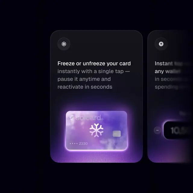
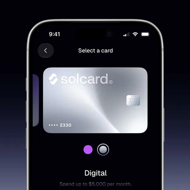
A dark-themed iOS card selection screen for Solcard featuring smooth swipe transitions between a vibrant purple gradient Platinum card and a silver metallic Digital card.
More like this
See all

Summary
A dark-themed iOS card selection screen for Solcard featuring smooth swipe transitions between a vibrant purple gradient Platinum card and a silver metallic Digital card.
Visual description
A dark iOS interface with a centered 'Select a card' header and a prominent metallic silver card dominating the middle third of the screen, displaying the Solcard logo and card ending. At the bottom, two colored dots (magenta and gray) represent card options, with the card label 'Digital' and spending limit copy positioned below. A back button sits in a circular container at top left, while the entire composition is bathed in dark navy background with soft shadows defining the card edges. The design prioritizes the card itself as the hero element against generous negative space.
Key takeaway
Center a single card-shaped element with soft rounded corners against dark background and use small colored indicators below to suggest swipeable alternatives. This approach makes selection intuitive while keeping the interface minimal and focused on the product itself.
Reuse notes
Reach for this as a ui screen reference. Pairs with minimal, clean directions. Original by Zipzap Design.