Preview image. Unlock full-res
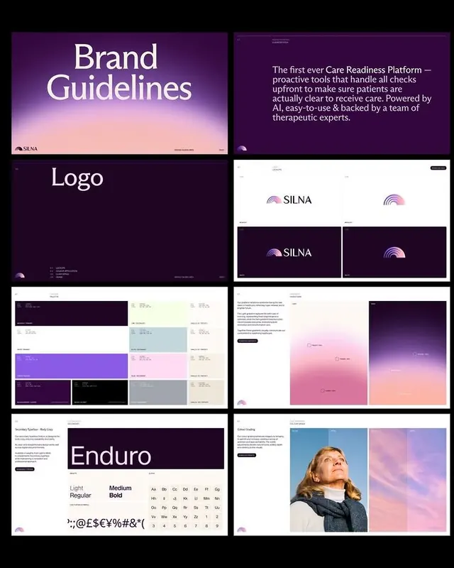
A brand-identity guide for a healthcare platform showing logo, typography, color system, and interface layouts using a deep-purple-to-pink gradient theme with photography examples.
Summary
A healthcare brand identity system for SILNA featuring a deep-purple-to-pink gradient palette, geometric logo, sans-serif type family, and white-space-forward interface layouts with lifestyle photography.
Visual description
A grid of brand-system components arranged on a light background: top left shows "Brand Guidelines" as an oversized serif headline on a dark purple-to-pink gradient; top right displays marketing copy about the platform on the same gradient. Below are sections for logo usage (showing the SILNA wordmark and geometric semicircle symbol in single and locked variations), a color-system grid with purple, pink, lavender, and neutral swatches, the Enduro typeface family in light and bold weights with special characters, and interface mockups showing white cards with small purple accents. The bottom section pairs a portrait photograph of a woman against a gradient sky (pink-to-purple fade) with supporting text, demonstrating photography color-grading guidelines. All typography is modern sans-serif except the "Brand Guidelines" headline.
Key takeaway
The gradient-as-system approach: applying a signature purple-to-pink fade consistently across brand assets (backgrounds, photography treatment, accent elements) without overuse in actual UI. The separation of brand guidelines, logo lockups, and functional interface mockups into distinct visual zones. The photography treatment as part of the brand system, not just a decorative afterthought.
Reuse notes
Ideal template for healthcare SaaS or consumer-health brands seeking to balance professionalism with a softer, more approachable personality. The gradient works best as a background or accent layer, not on text, to preserve legibility. The structured grid-layout approach translates directly to design-system documentation and Figma brands.