Preview image. Unlock full-res
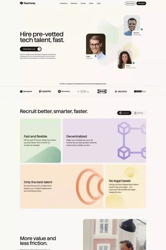
SaaS landing page for Teamway featuring layered hero section with headshots and gradient feature cards showcasing hiring workflow benefits in soft pastels and warm tones.
Summary
Teamway recruitment SaaS landing page with bold left-aligned hero copy, three rounded candidate headshot cards with status badges, and a five-card bento grid below showcasing hiring workflow benefits via soft gradient backgrounds and simple icon illustrations.
Visual description
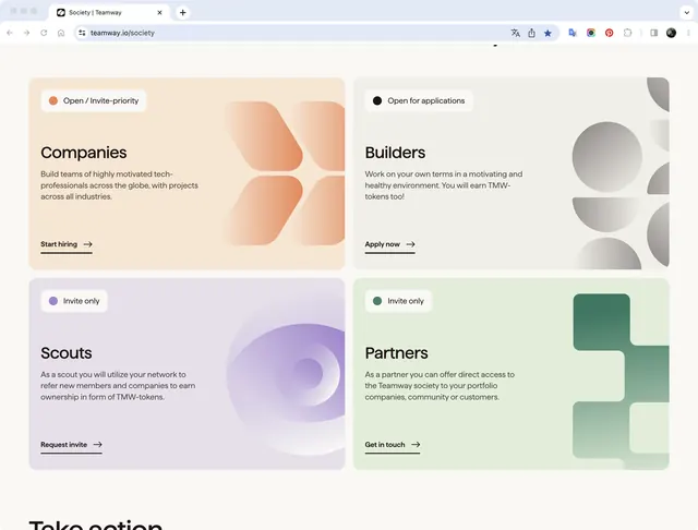
Top section: minimal navbar with Teamway logo, horizontal navigation, and two CTA buttons (white outline and dark filled). Hero headline on left ("Hire pre-vetted tech talent, fast") with body copy and a dark-filled button; three rounded portrait cards arranged on the right with gradient overlays (light green, pale yellow, light blue) and role/status badges. Center divider with client logo wall. Below: five-card grid (2-2-1 layout) with soft pastel gradients (light green, light purple, peach, yellow) containing short headlines, descriptive text, and simple geometric icon illustrations (shapes representing flexibility, network, filters, speech, building). Clean sans-serif typography throughout, with ample whitespace and soft color separation rather than borders.
Key takeaway
The soft gradient-background card pattern reduces visual harshness while maintaining clear content zones, making it approachable rather than corporate. Status badges on headshots add trust signals without visual clutter. The asymmetric bento layout (five items across two rows) feels modern and avoids rigid grids while remaining scannable.
Reuse notes
Ideal for recruitment, HR tech, talent marketplaces, or any B2B SaaS targeting trust and approachability. Works well for platforms with multiple value propositions (features) that need hierarchy. The warm, muted palette reads as non-aggressive and fits professional/enterprise contexts. Candidate photos establish human connection quickly.