Preview image. Unlock full-res
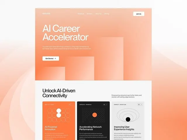
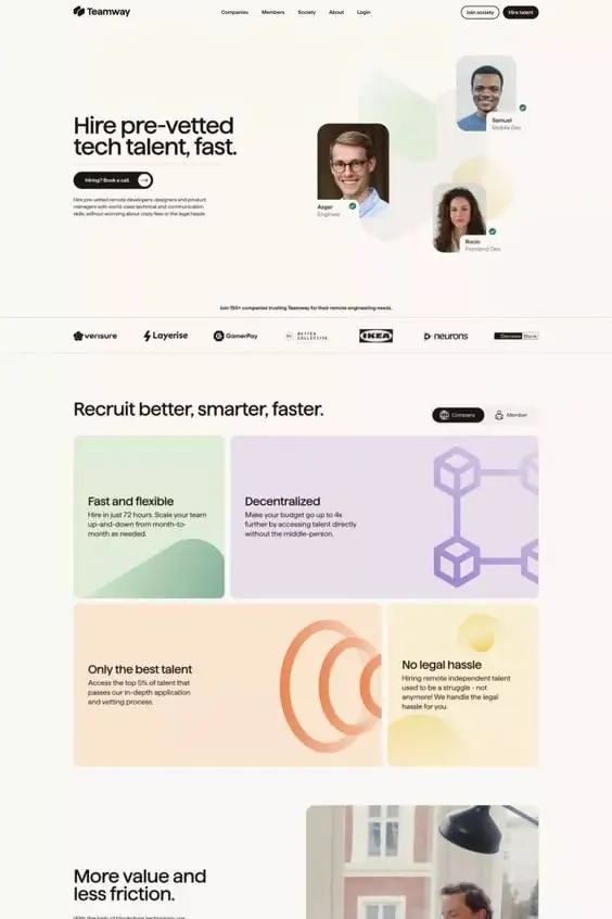
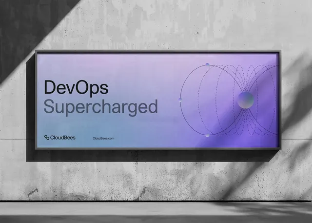
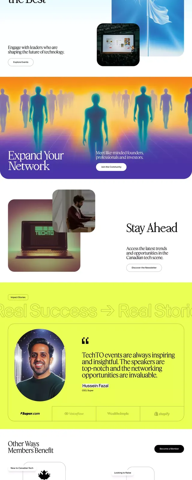
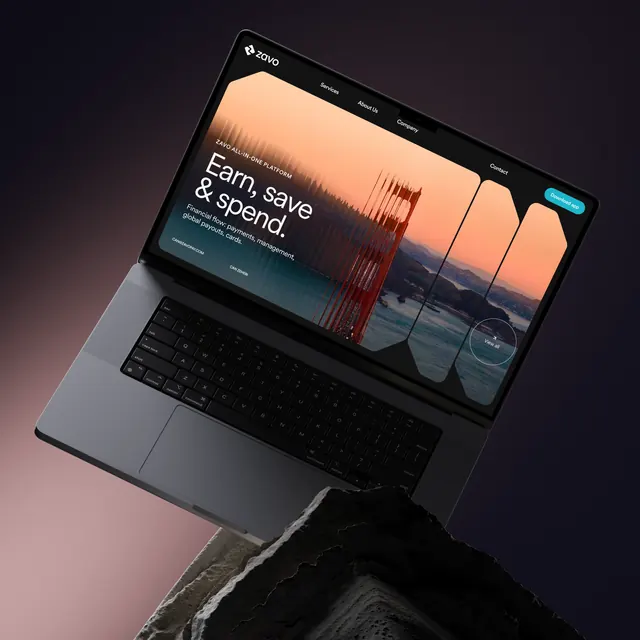
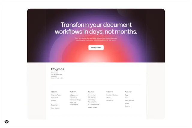
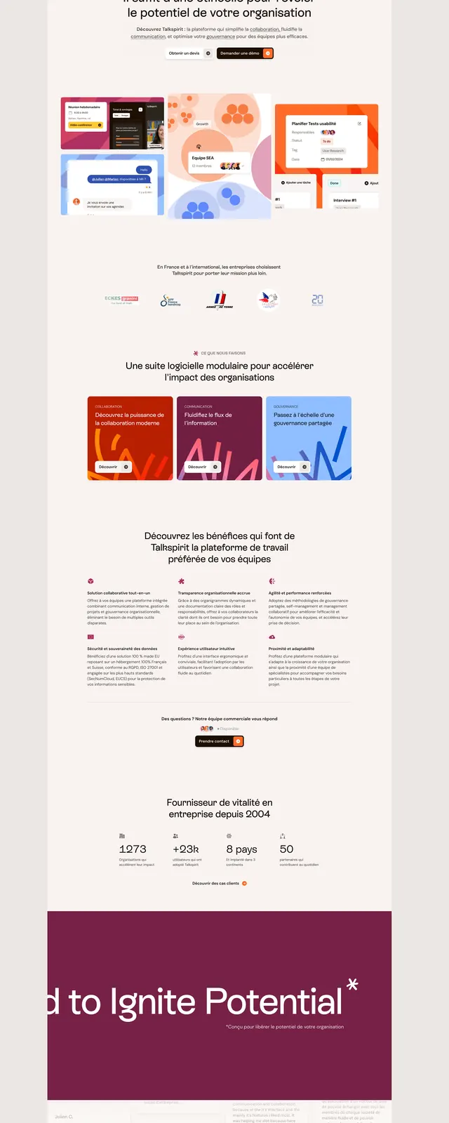
SaaS onboarding page with soft coral, peach, and blue gradient card UI mockups, testimonials, and benefit sections on a light neutral background.
Summary
A SaaS product onboarding page combining soft color-blocked card mockups (coral, peach, blue UI sketches) with testimonials and benefit rows, unified by rounded shapes, ample white space, and a final burgundy hero section.
Visual description
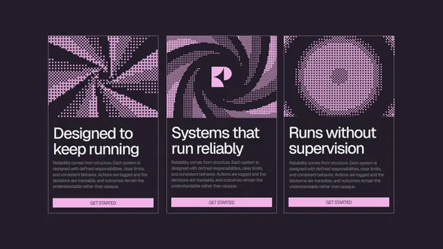
Light beige background with "ENIGMA" wordmark and minimal nav at the top. Hero section shows two computer-mockup cards (red/navy UI sketches) flanked by abstract gradient shapes in coral, blue, and peach. Below, alternating sections: a 3-card testimonial row, a 3-column benefit block (cards with burgundy, purple, and blue gradient backgrounds), stats counter (1273, +250, 8 apps, 50), and a dark burgundy hero section with white type and a star accent. Soft rounded corners and consistent 16px/24px spacing throughout.
Key takeaway
The soft pastel gradient palette (peach, coral, light blue, dusty purple) creates sophistication without saturation. Rounded corner UI cards against plain background read clean yet friendly. Alternating dark hero sections (burgundy) with light content sections creates rhythm and focus.
Reuse notes
Strong for B2B SaaS, organizational tools, or fintech onboarding. Card mockups work well for "product overview" sections. Keep imagery/mockups high contrast against the soft background.