Preview image. Unlock full-res
A camping and glamping discovery app using oversized color-blocked cards, bold typography, and nature imagery to promote outdoor reservations.
Summary
An outdoor and glamping booking app uses oversized color-blocked cards, bold display type, and outdoor photography to showcase campsite discovery and booking flows.
Visual description
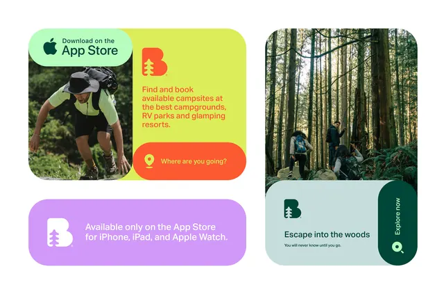
The interface is divided into a left promotional column and a right featured-destination card. On the left: an App Store badge sits atop a hiker photo in a rounded pill card; below is bright lime-yellow text reading "Find and book available campsites at the best campgrounds, RV parks and glamping resorts," anchored by an orange pill-shaped "Where are you going?" search prompt; a purple card at the bottom states App Store availability. On the right: a forest photograph dominates a pale teal card, with forest-green text reading "Escape into the woods" and smaller sub-copy, accompanied by matching forest-green circular button icons. Typography is bold, sans-serif, and oversized for headlines; smaller fonts handle descriptive text.
Key takeaway
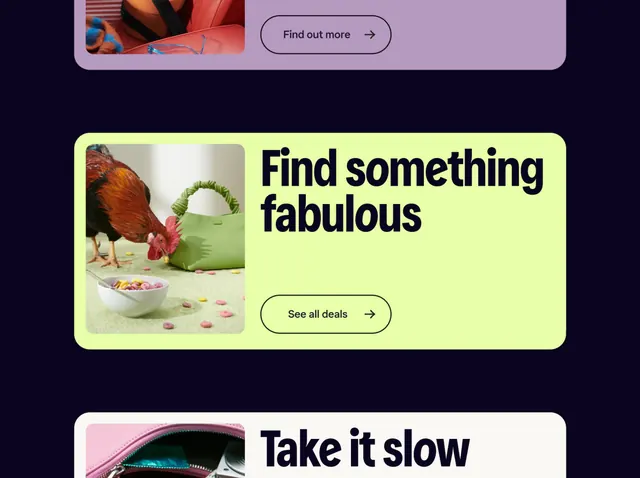
Color-blocking (lime, yellow, orange, purple, teal, forest green) applied to card backgrounds creates instant visual interest and can encode different booking categories. The combination of outdoor photography with solid color overlays maintains brand legibility while preserving authentic imagery. The pill-shaped CTAs and buttons feel cohesive and friendly.
Reuse notes
Works well for travel, leisure, and adventure apps. The vivid color palette suits youthful, outdoor-oriented brands. Oversized bold typography on cards is effective for quick scanning. Reserve photography for hero cards; use color blocks elsewhere to avoid visual overwhelm.