Preview image. Unlock full-res
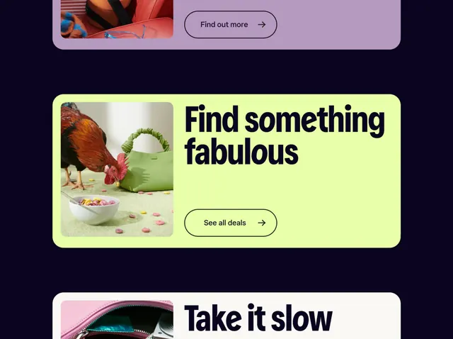
Ecommerce landing layout using rounded-corner cards on a dark navy background, with lime-green and lavender cards containing product photography and bold sans-serif CTAs.
Summary
Ecommerce grid layout using brightly-colored rounded-corner cards on dark navy ground, mixing pastel and neon hues to showcase products with bold copy and prominent "See all deals" button.
Visual description
Dark navy background with three stacked rounded-rectangle cards. Top card (partially visible): lavender/purple tones with product photo and "Find out more" button with arrow. Middle card (lime-green/chartreuse background): left side has rounded-corner product photo of a chicken/bowl with pink garnish; right side contains large black sans-serif headline "Find something fabulous" with "See all deals" button in olive outline below. Bottom card (pale pink, partially visible): dark navy bold text. All cards have thick rounded corners (12px+), generous padding, and organized image-text pairing. The color contrast between neon-bright card backgrounds and dark navy surround creates visual separation and focus.
Key takeaway
Dark navy backdrop amplifies pastel and neon card colors without clutter. Rounded corners soften the geometry while maintaining a modern feel. Image + text pairing on the same card with clear CTA hierarchy (larger button with arrow) drives conversion. The "See all" secondary action below the headline reduces cognitive load.
Reuse notes
Strong for food, lifestyle, and ecommerce sites targeting younger audiences or playful brands. Lime-green and lavender together read as fresh and friendly; pair with dark ground to avoid overwhelming. Works equally well for product discovery, deals, collections. Adapt headline for urgency (sale, limited, new) to drive engagement.
More like this
Keep what you find
A free account saves references to boards and can send you a weekly email of picks based on what you save.
To see every result, go Pro.