Preview image. Unlock full-res
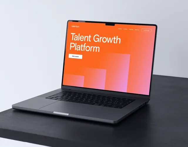
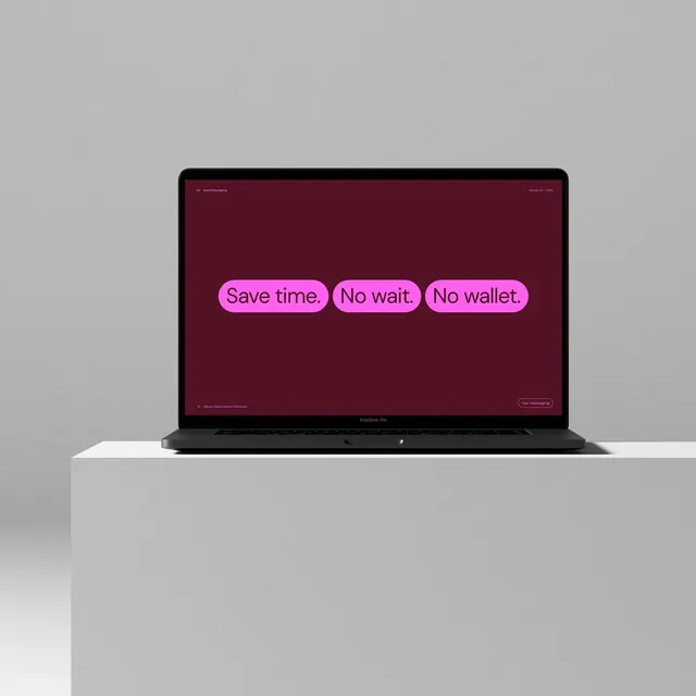
A laptop mockup displaying three benefit statements in bright magenta rounded pills centered on a deep burgundy background, communicating core value messaging.
Summary
A web interface mockup displayed on a MacBook showing three value-proposition callouts as bright magenta rounded pill buttons on a deep burgundy background.
Visual description
A dark MacBook Pro displays a full-screen interface with a deep burgundy (almost maroon) background. Three rounded pill buttons in bright magenta hover in the center of the screen, each containing white sans-serif text: "Save time," "No wait," "No wallet." The typography is large, bold, and sans-serif with generous letter spacing. Small interface chrome sits at top (navigation) and bottom (footer with soft text), but the visual weight rests entirely on the three centered pills. The contrast between the dark background and the neon-bright magenta is high and immediate. A light-gray base beneath the laptop completes a minimalist product-shot composition.
Key takeaway
Direct value callouts as interactive pills with a bold, predictable shape and consistent sizing. High contrast between background and CTA (dark burgundy to magenta is dramatic, reads across a room). Centering and generous spacing lets the messaging breathe and dominate the visual hierarchy.
Reuse notes
Excellent for fintech, SaaS, or consumer-app hero sections where core benefits must land instantly. The magenta works for brands with personality and confidence; for more conservative industries (banking, insurance) shift to cooler accent tones. Works best when copy is short and punchy.