Preview image. Unlock full-res
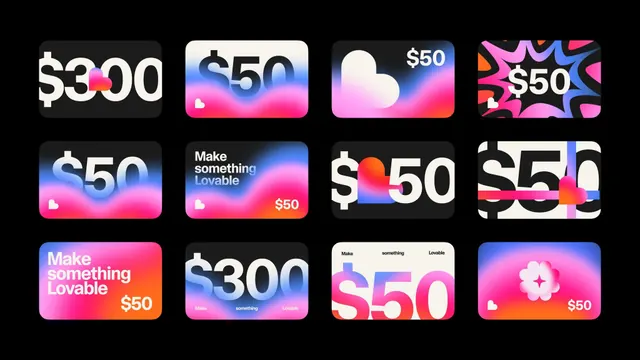
A grid of 12 colorful payment or rewards cards set on black, each blending price text with gradient backgrounds and soft white iconography (hearts, clouds, sparkles).
Summary
A grid of 12 colorful payment or rewards cards set on black, each blending price text with gradient backgrounds and soft white iconography (hearts, clouds, sparkles).
Visual description
Arranged on a black background are three rows of four cards. Each card is a rounded rectangle with a vibrant gradient fill. The top row holds cards in light pink-to-cyan, sky blue, and pastel-gradient ranges. The middle row shows hot-pink-to-orange, light pink, and magenta-with-abstract-shapes. The bottom row uses deep blue gradients and saturated magenta. Every card overlays a large white sans-serif price figure ($50, $300, etc.) and often includes centered white icons (small solid heart, cloud, or sparkle) plus small text lines like "Make something Lovable." The gradients are smooth and radial; the overall feel is modern and approachable, balancing playfulness with clear transaction-focused content.
Key takeaway
The combination of bold gradient + centered icon + price creates an immediately scannable, approachable payment UI. The neon-and-soft-shape vocabulary (hearts, clouds) humanizes financial transactions. Useful pattern for SaaS billing, app in-app purchases, or reward-tier displays where you want to feel friendly rather than corporate.
Reuse notes
Strong for consumer fintech, e-wallets, subscription apps, or loyalty programs targeting younger audiences. The dark background makes each card pop; swap to light background and desaturate if aiming for corporate audiences. The variety of gradient directions and color combos works well as a swatch system you can extract and adapt. Card size suggests mobile-first design.