Preview image. Unlock full-res
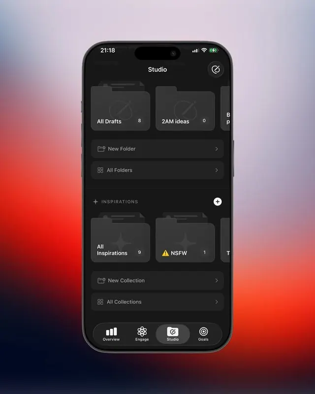
Dark-mode mobile interface organizing files and collections into folded card groups, anchored by a bottom tab navigation bar over a warm-to-cool gradient background.
Summary
Folder-based file organization on a dark mobile app with soft gradient background (pink/blue/red), card-style section headers, and tabbed navigation bottom bar.
Visual description
Dark charcoal mobile screen with a soft pink-to-blue gradient visible behind the interface. "Studio" header appears at top with a circular settings/filter icon. Content is organized into collapsible sections: "All Drafts" (8 items) and "2AM ideas" (0 items) displayed as folded card groups at the top; a "New Folder" action link; "All Folders" menu item with chevron; an "INSPIRATIONS" section divider (plus-icon button at right) with folders "All Inspirations" (9 items) and "NSFW" (1, flagged with yellow warning icon); a "New Collection" link and "All Collections" menu. A dark button bar at the bottom displays four iconographic tabs: Overview, Engage, Studio (highlighted), and Goals. Text is clean white on dark gray cards, maintaining strong contrast. The overall visual hierarchy uses negative space, subtle card shadows, and functional color accents (red number badge, yellow warning triangle).
Key takeaway
Layering card-based groups within a gradient background creates visual depth without heavy contrast shifts in dark mode. Counter badges (8, 0, 9, 1) positioned top-right of folder cards tell the user content volume at a glance. A bottom tab bar (four minimal icons) keeps navigation persistent and thumb-accessible on mobile. The gradient backdrop provides visual interest behind what is otherwise a neutral dark UI without competing with the content.
Reuse notes
Ideal for content-management and organization-heavy mobile apps (note-taking, file managers, project tools, collections). The folder + badge pattern scales to 4+ categories cleanly. Bottom tab nav works well for 3-5 main modes (Overview / Engage / Create / Studio / Goals). The gradient backdrop works best when muted and warm-to-cool (pinks, blues) to avoid overwhelming the dark foreground. Not recommended for data-heavy dashboards where gradient might add unwanted motion perception.