Preview image. Unlock full-res
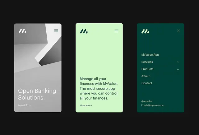
A fintech app showing three modal states: neutral launch card, mint-green value proposition, and teal navigation drawer, demonstrating color-coded information hierarchy.
Summary
Three mockups of a fintech app showing modal and drawer states: gray onboarding card, mint-green value proposition, and teal menu with expandable nav items, establishing a trustworthy financial app system.
Visual description
Three vertically stacked card frames on black background. Left card: gray and white split with angled chevron logo, "Open Banking Solutions" headline and "More info" link. Center card: pale mint background with dark teal logo, centered copy "Manage all your finances with MyValue. The most secure app where you can control all your finances." and "More info" link. Right card: deep teal with white logo and close button, containing app name "MyValue App", navigation items "Services" and "Products" with dropdown carets, "About", "Contact" links, and footer social handle plus email. All cards use generous padding and clean sans-serif typography in the same weight family.
Key takeaway
Color-coding modal states and drawers (gray for intro, mint for value, teal for navigation) makes information hierarchy instant and scannable without extra UI layers. The angled chevron logo reading as "forward motion" reinforces the financial-movement narrative. Matching logo placement and typography weight across all three states creates system consistency.
Reuse notes
Essential for fintech SaaS, banking apps, and payment platforms where trust and security are selling points. The mint-to-teal palette works especially well for audience segments wanting approachable-yet-secure tone. Ensure logo stays visible and button text reads at mobile viewport sizes; the generous padding here translates well to narrow screens but can be tightened if real estate is constrained.