Preview image. Unlock full-res
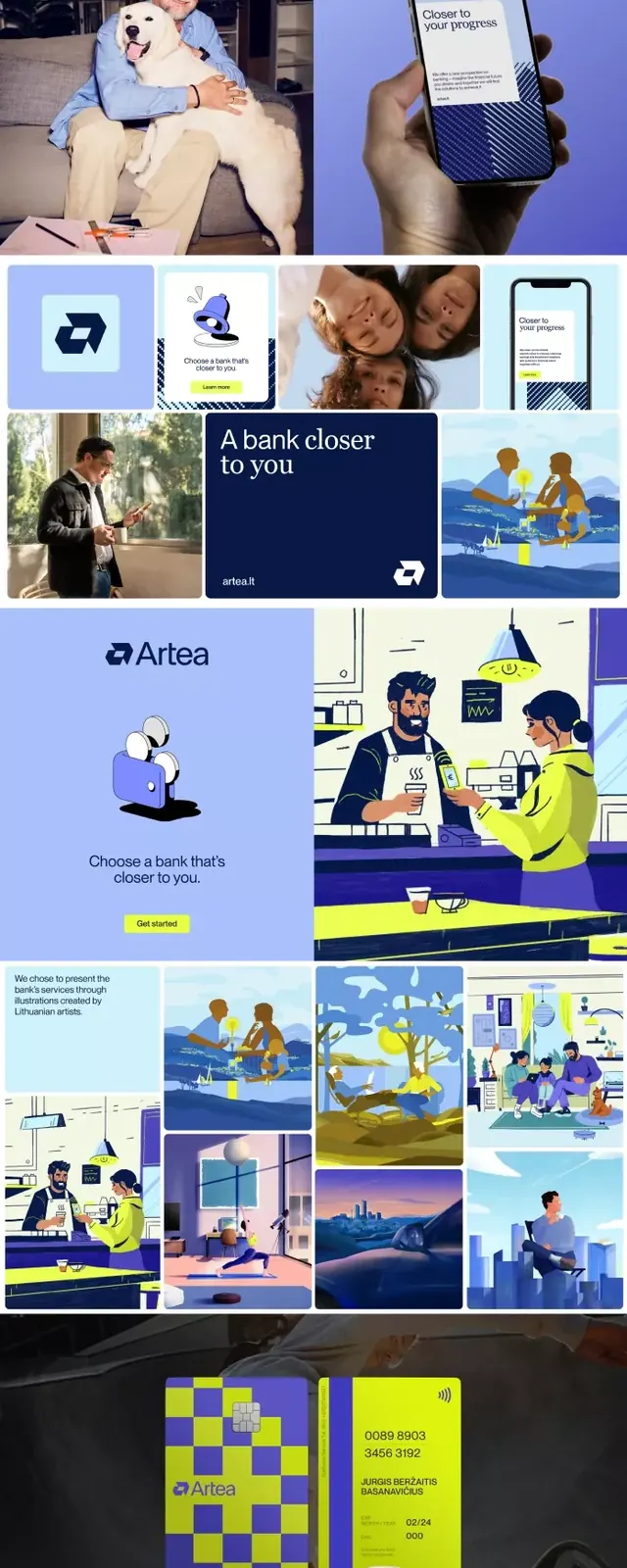
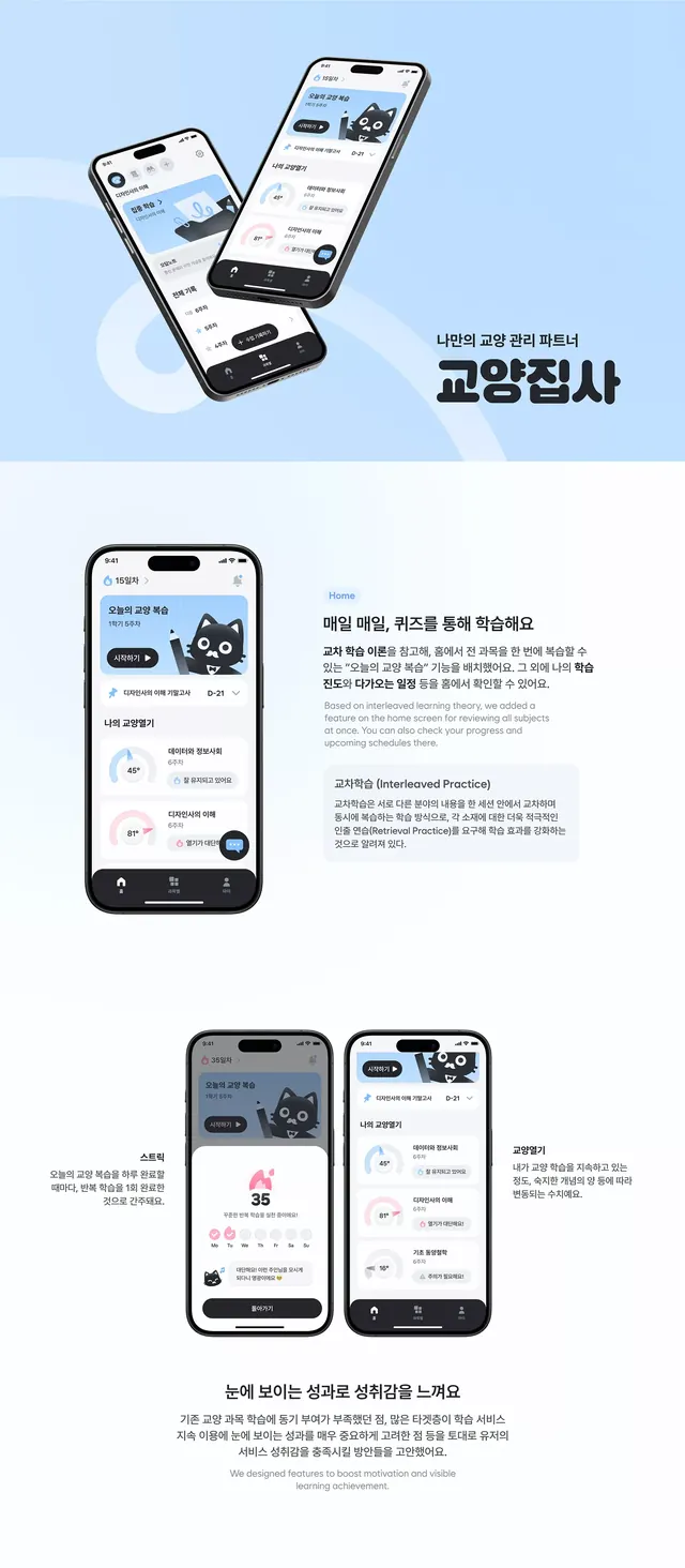
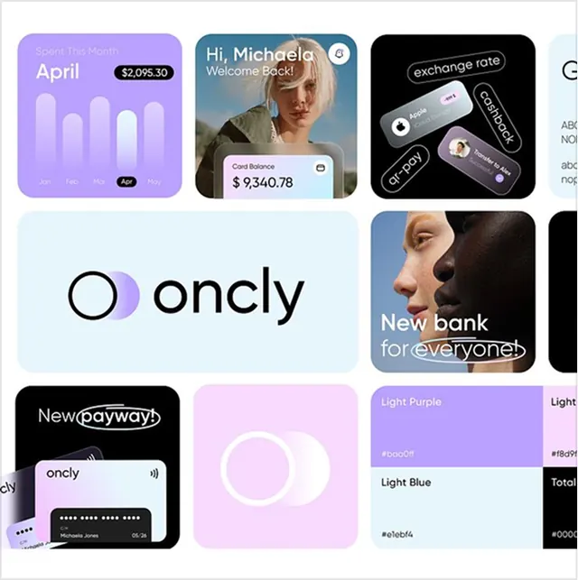
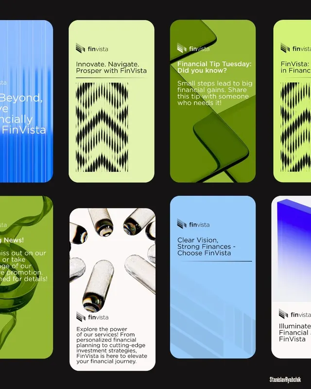
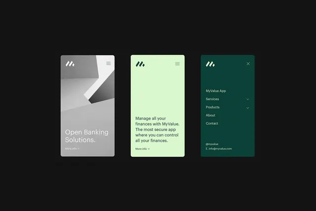
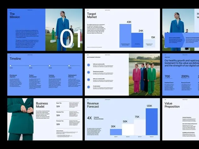
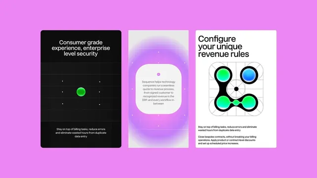
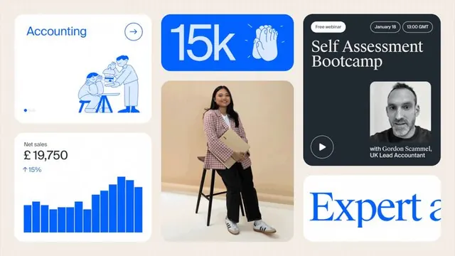
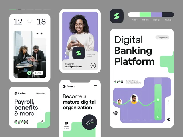
Banking app UI screens with professional photography, clean typography, and lime-green accents for interactive elements and data visualization.
Summary
A fintech app UI system with user-onboarding cards, product benefits screen, and dashboard graphs, unified by lime-green accents and layered photography against white cards.
Visual description
Six card-based UI screens showing a fintech platform. The cards use white backgrounds with generous padding and subtle rounded corners. User photos and product shots are integrated as hero images within cards. The lime-green accent color appears as badges, button fills, CTA indicators, and chart highlights. Typography is clean sans-serif, with large primary headers (e.g. "Digital Banking Platform") and smaller body copy in gray. One screen shows a multi-user face grid with a timer callout. Another displays user avatar photos with sub-labels. A chart screen uses lime fill for the vertical bars and small avatar icons for context. The overall grid composition and soft-corner card design create visual rhythm while the accent color guides focus to interactive elements.
Key takeaway
The consistent use of photography as hero content within cards, with accent color applied as functional UI (not just decorative). The balance of white space with content, and the strategic placement of the bright lime against a cool purple-gray and black palette.
Reuse notes
Strong pattern for fintech or SaaS onboarding. The photography-in-cards approach works for user-first products (banking, HR, team tools, social). The lime accent is punchy enough to work on mobile; ensure good contrast for accessibility testing.