Preview image. Unlock full-res
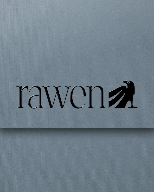
Minimalist wordmark logo pairing lowercase serif type with a geometric bird silhouette, rendered in monochrome on a muted blue-gray background.
Summary
A monochrome logo combining the word "rawen" in lowercase serif type with a simplified geometric silhouette of a bird, positioned to the right of the text.
Visual description
The logo sits centered on a soft blue-gray background. The wordmark uses a serif typeface with even weight, all lowercase, rendered in black. The bird icon is a monoline, geometric shape (outline only), scaled to the cap-height of the letterforms, aligned to the right of the final "n". The silhouette is minimal, showing the bird's head in profile with a sharp eye detail. The overall composition is horizontal and balanced, with ample negative space on all sides. The palette is purely monochromatic: black figures on gray background, no accent color.
Key takeaway
The integration of a simple icon directly into a wordmark (not a separate symbol mark). The serif choice paired with the geometric icon creates sophisticated contrast. The monoline bird style is memorable and scales well across sizes.
Reuse notes
Effective for design-focused or luxury brands needing understated identity. Works at small sizes (favicon, app icon) and scales to large formats (signage). The serif + geometric mix avoids feeling precious; pair with generous spacing in layouts to preserve elegance.