Preview image. Unlock full-res
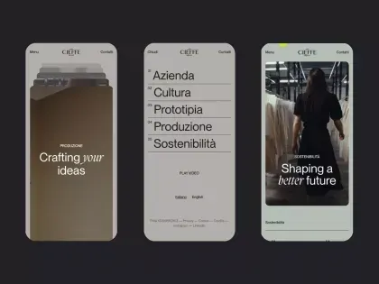
Three mobile app screens showing a cohesive design system with earthy tones, structured navigation, and expressive typography presenting an editorial aesthetic.
Summary
Three mobile app screens displayed side by side, each using earthy backgrounds, structured navigation lists, and editorial typography to create a sophisticated design system.
Visual description
Three iPhone-width screens arranged horizontally against a dark background. Left screen: brown/tan hero background with white italic headline "Crafting your ideas" and small supporting text. Center screen: light beige background with a clean list of navigation items (Azienda, Cultura, Prototipia, Produzione, Sostenibilita) in a sans-serif typeface, with a small header label above. Right screen: mint green background with a full-bleed fashion photograph and white italic headline "Shaping a better future" overlaid. All three screens share a minimal header bar at the top with navigation elements. Monochromatic type treatment, generous white space, and consistent spacing create visual unity across the trio.
Key takeaway
The three-screen system demonstrates how a single color palette (earths and sage) can work across different screen states: hero imagery, structured navigation, and photography. The use of italic display type paired with sans-serif body text creates editorial sophistication while maintaining readability.
Reuse notes
Excellent template for portfolio or editorial apps where screen states need to feel cohesive but distinct. The earthy palette and typography approach works best for lifestyle, fashion, or creative industry brands. Works well when users need to move between browsing, navigating categories, and viewing imagery.
More like this
Keep what you find
A free account saves references to boards and can send you a weekly email of picks based on what you save.
To see every result, go Pro.