Preview image. Unlock full-res
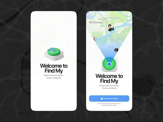
Two mobile onboarding screens for a location-sharing app with a 3D green beacon icon on the left and an interactive map interface with gradient blue overlay and call-to-action button on the right.
Summary
A two-panel mobile onboarding sequence for a location-sharing service: the left screen features a 3D green beacon icon on white, while the right shows an interactive map with user avatars and a blue call-to-action button, teaching the feature through visual metaphor and live context.
Visual description
Two adjacent phone frames on a dark charcoal background present complementary onboarding moments. The left frame uses a white card background with centered copy "Welcome to Find My" and supporting text about easily locating devices. A stylized 3D green beacon sits above, rendered with dimensional shading and perspective. The right frame mirrors the layout but substitutes the beacon with a live map view showing Richmond geography in map-style colors (pale green, light blue), two user avatar circles (one blue, one coral-toned), and a prominent gradient-filled blue button labeled "Continue with Apple" at the bottom. Both screens share consistent sans-serif typography in dark charcoal, generous whitespace, and rounded-rectangle cards against the dark background. The two-screen arrangement models the transition from welcome copy to actual feature engagement.
Key takeaway
The split-screen onboarding pattern teaches the feature by showing the icon metaphor on one side and the real feature on the other, reducing cognitive load. The 3D beacon adds dimensionality and approachability without clutter. The map portion uses actual product UI (map, avatars, button) as proof-of-concept, building trust. The cool color palette (blues, greens, off-whites) signals location technology confidently.
Reuse notes
Excellent template for any location, social, or device-finding app. The two-card format works best on modern phone viewports. The 3D beacon is brand-specific; substitute with your own metaphorical asset. The map background is effective for location products but can be swapped for other contextual imagery (contacts, devices, etc.). Ensure the call-to-action button is accessible and stands out; the gradient blue here balances visibility with the cool palette.