Preview image. Unlock full-res
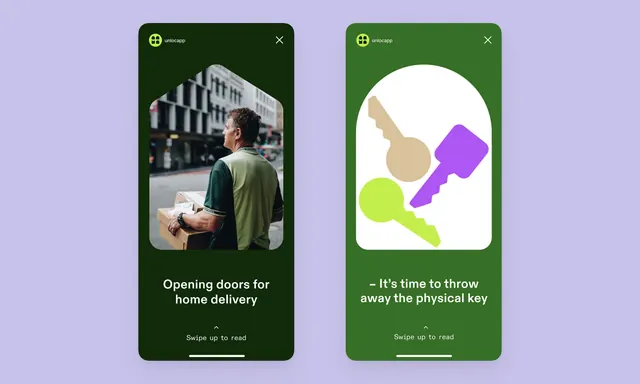
Two mobile app screens for Uniocapp presenting home-delivery and digital-key messaging over dark forest-green backgrounds, paired with colorful abstract shape illustrations on a lavender-purple canvas.
Summary
Two side-by-side mobile screens for a delivery app using dark forest-green full-bleed backgrounds, white headline copy, and bold flat geometric shapes in lime and magenta to illustrate service benefits.
Visual description
Left screen: a photograph of a delivery courier holding a package against a dark-green background with the headline "Opening doors for home delivery" and a "Swipe up to read" affordance. Right screen: the same dark-green background with abstract flat shapes (a tan pear, lime-green key, and magenta square) on a white circular background, accompanied by "It's time to throw away the physical key" and an identical swipe affordance. Both screens share the Uniocapp header logo (yellow cross-shape on the dark background), rounded corner app-frame styling, and use the same sans-serif typography for maximum visual cohesion.
Key takeaway
The bold contrast of dark forest-green as a confident, standalone frame color that requires no additional visual noise; the pairing of photographic product imagery with abstract geometric illustration to balance realism and whimsy; the tight use of white space and centered text creating clear focal points without excess decoration.
Reuse notes
Well-suited for logistics, delivery, or home-services apps targeting a trustworthy, modern brand perception. The dark-green background is distinctive enough to create strong brand association while remaining accessible. The two-screen pattern works as onboarding or feature-highlight flow; substitute your own photography and illustrations while keeping the layout unchanged.